SYDNEY COMMUNITY FUND
Collective goodwill is at the heart of Sydney Community Foundation. It is a vehicle for collective impact, connecting foundations, government, individual and corporate philanthropy with local, grassroots charities.
THE SITUATION
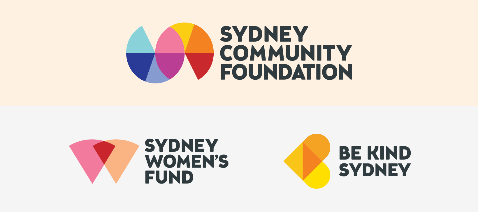
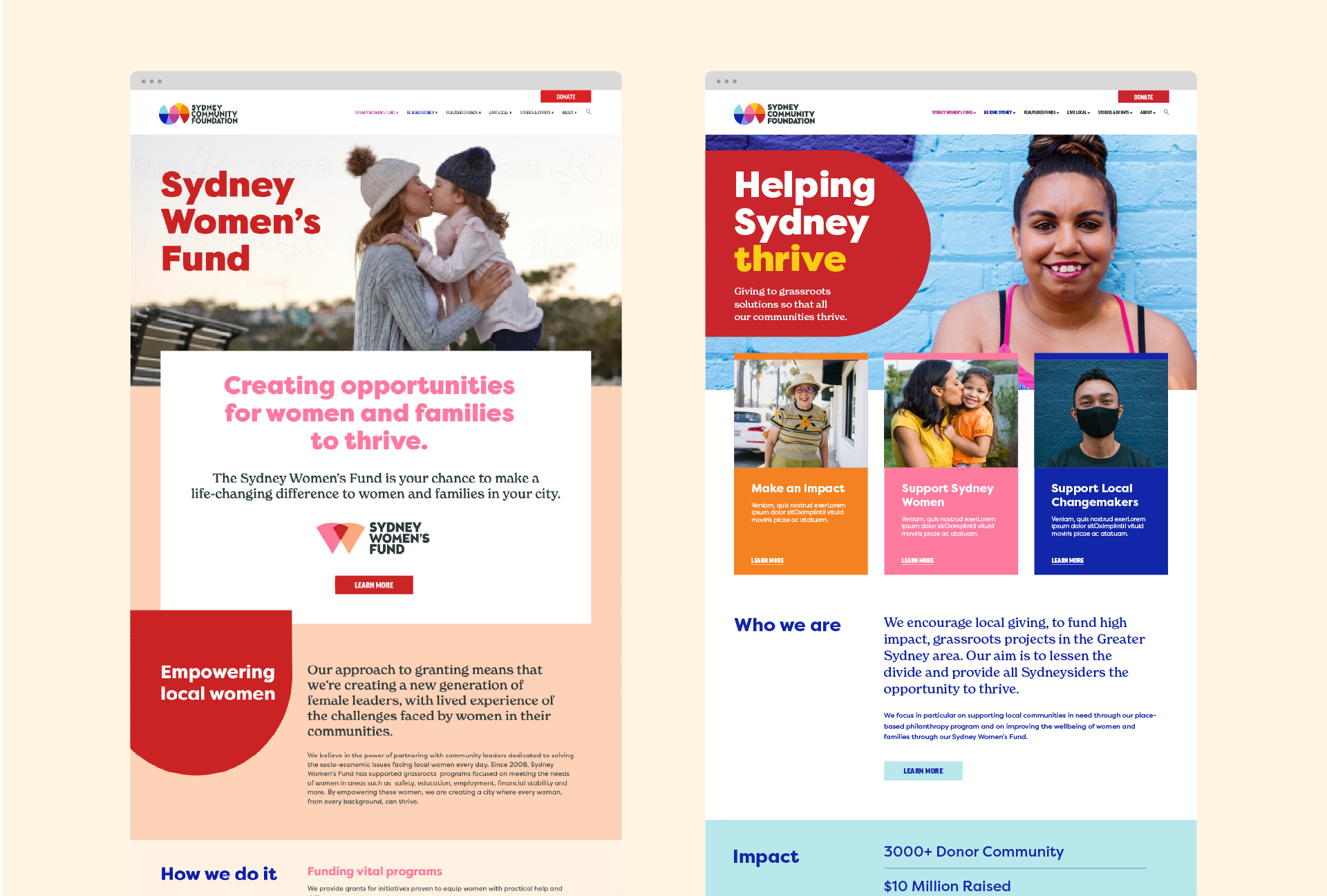
Sydney Community Foundation needed to create a masterbrand that would create symbiosis and cohesion between itself and it’s two major sub brands; Sydney Women’s Fund and Be Kind Sydney.
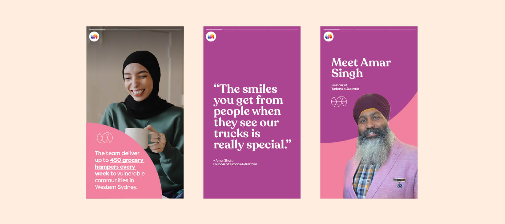
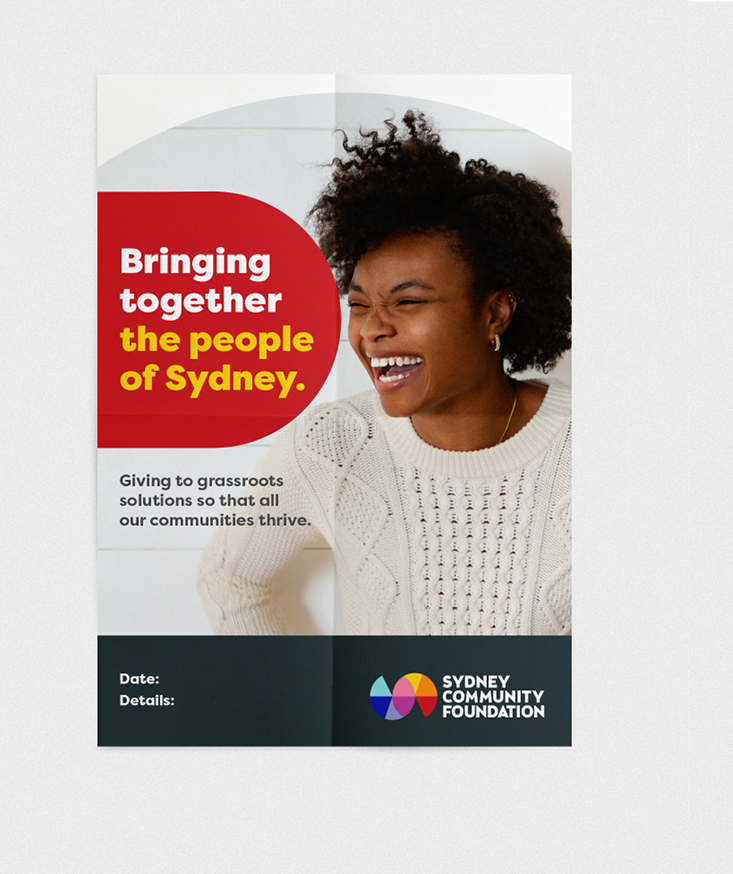
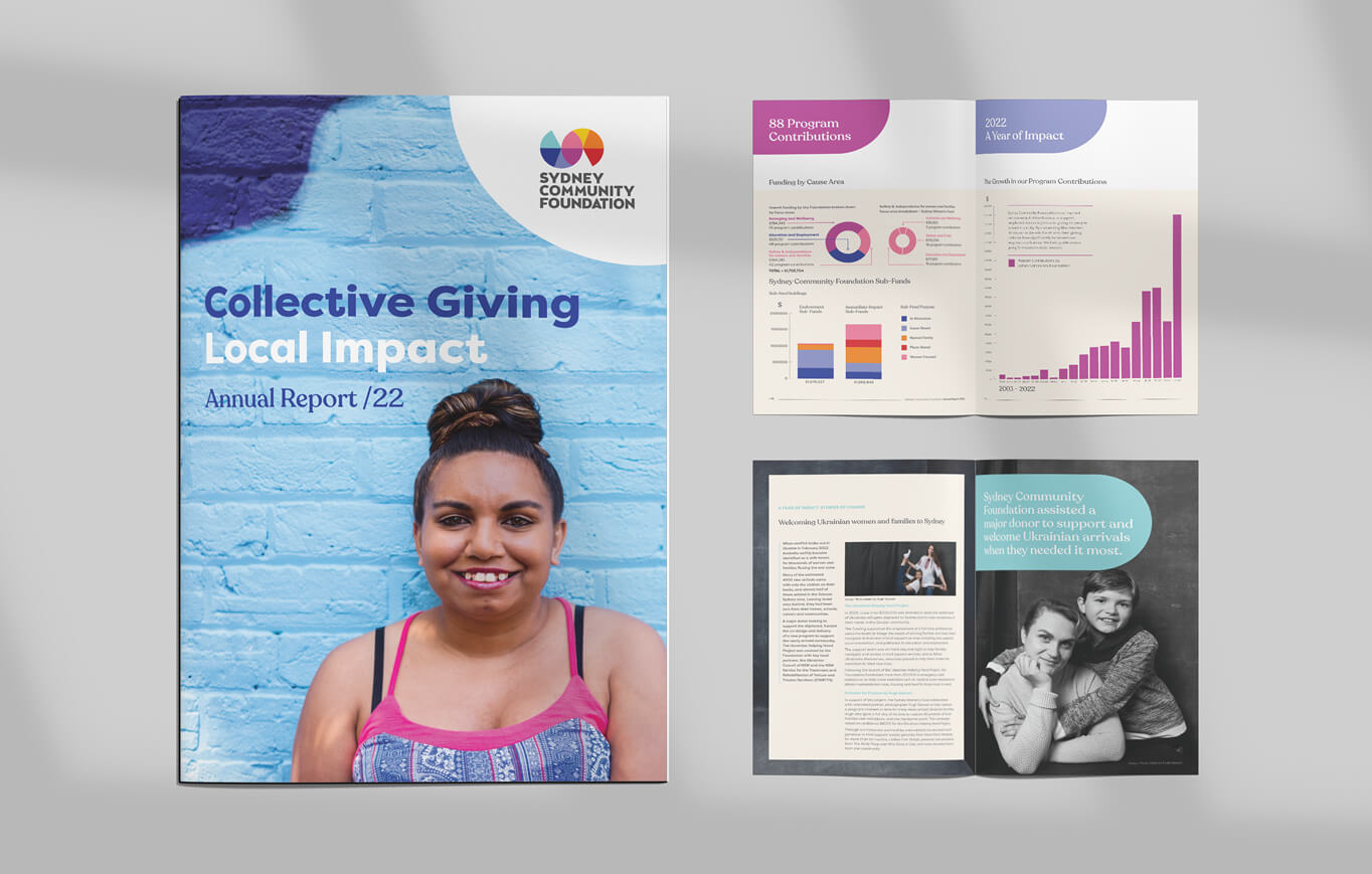
The Foundation casts a wide net of supporters, collaborators, investors and beneficiaries. Therefore the visual identity needs to be inclusive, open, non-gendered and flexible, while reflecting the vibrancy, momentum and diversity of our amazing, sprawling city.
THE SOLUTION
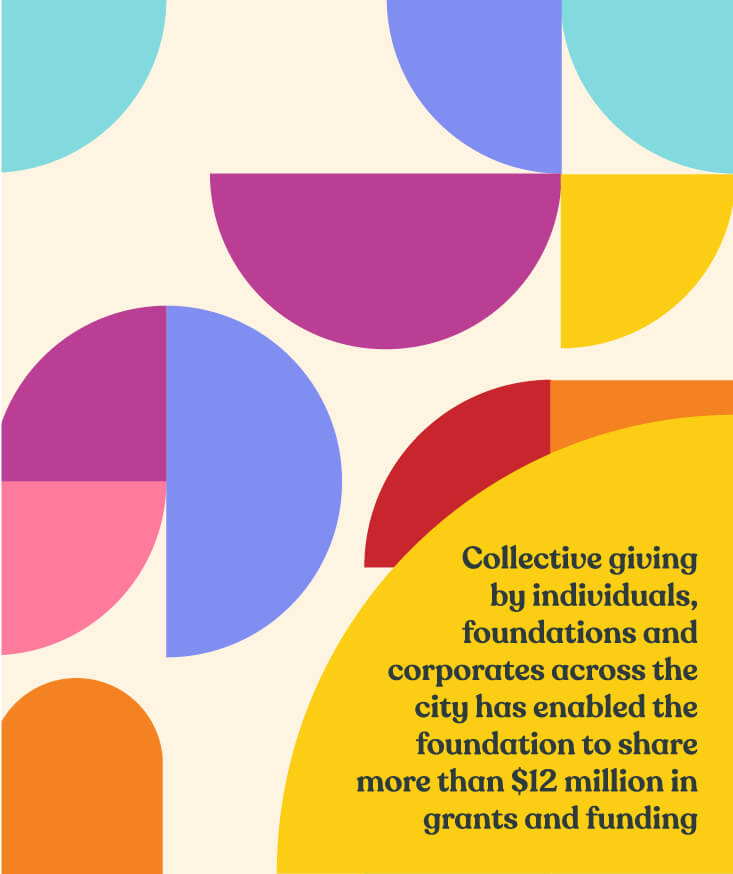
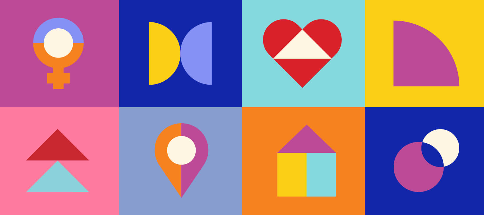
The new brand is fronted by an iconic logo that is rich in meaning, made up of bold, colourful geometric shapes connecting together to form and unfurl to a curved horizontal ‘S’ path, symbolising movement, transition and moving together with a subtle nod to the Sydney Opera House. Central to the mission and purpose of SCF is people of all backgrounds throughout Sydney, coming together to connect and create something bigger than themselves, and this sentiment is visually articulated in the logo. However it remains essentially abstract, giving the viewer agency and ownership to make their meaning.
We developed a clear brand architecture for the three brands and a system so there is roadmap for clarity and consistency as SCF grows and more sub brands are created. The existing sub brand colours (SWF pink and BKS yellow) are now held within the master brand, and extended into logos derived from shapes from the master logo. The established and significant brand equity, recognition and goodwill of these brands is reflected back and forth.
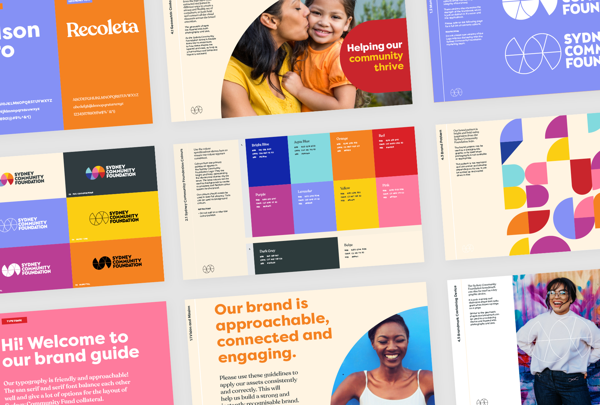
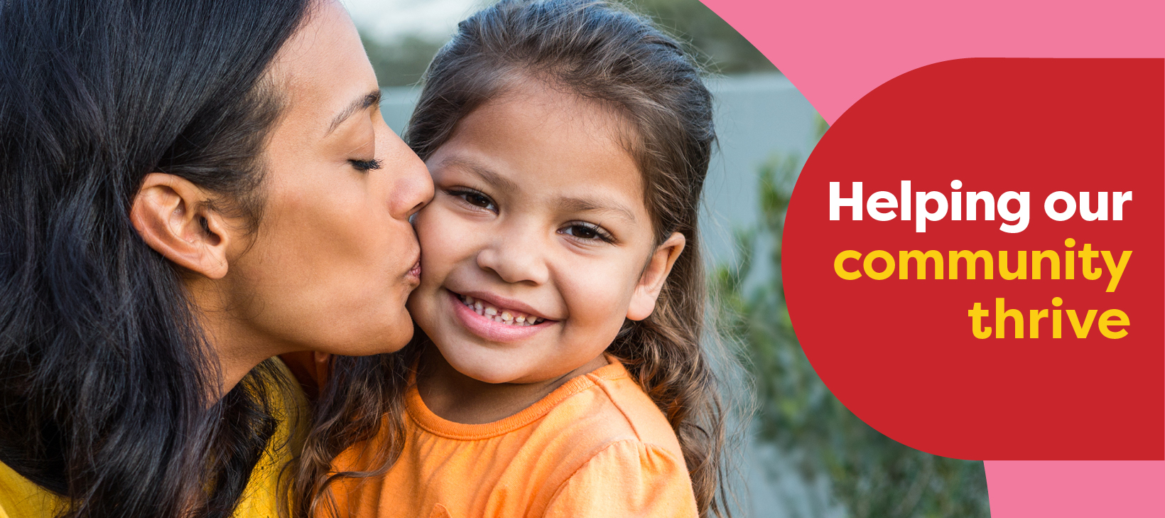
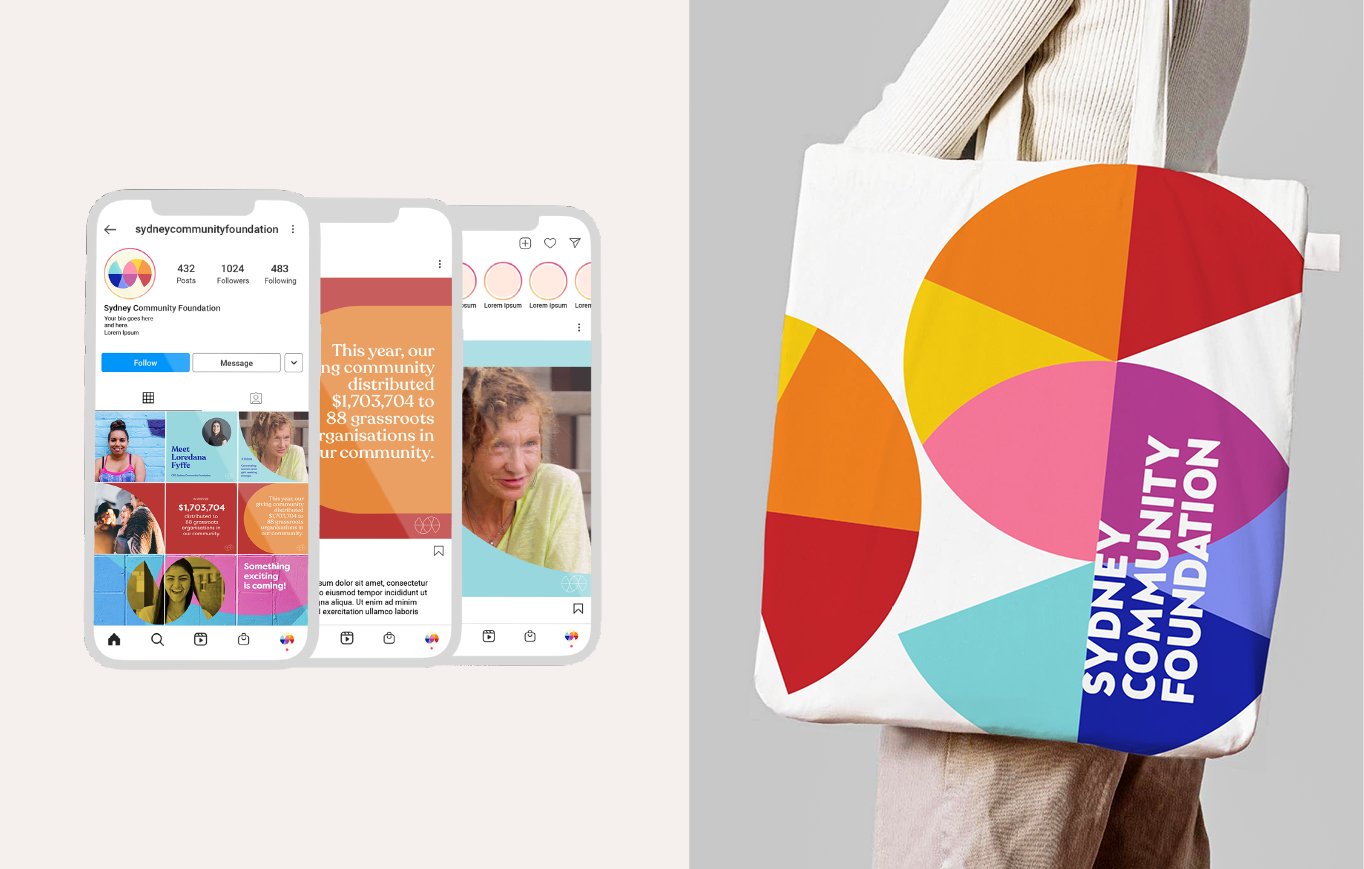
The geometric shapes from the logo have been extracted and joined in different ways to create a strong and flexible set of containers, to both hold and connect all the visual elements across the brand execution, creating a well rounded, recognisable and connected brand.

“We gave Three Blocks Left a difficult task, to create a hierarchy of brands to help our audience better understand our structure. Sounds easy, but when your sub-brands are more well-known that your master brand, it really is not.
Kylie and Kass listened and learned, and took on the problem deeply. They also helped us articulate what we wanted to be, represent and who we wanted to serve into the future. We realised, that Sydney is bright, optimistic and hopeful and that the Sydney Community Foundation brand should reflect that.
They came up with a brilliant device to make the sub brands reflect the master, a collection of its key elements and have delivered something to last. We’re grateful and continue to work with them to develop key assets that will help us build the Fund for Sydney now and forever.”
LOREDANA FYFFE , CEO
SYDNEY COMMUNITY FOUNDATION, SYDNEY WOMEN’S FUND & BE KIND SYDNEY