HOPE BONDI
Branding a project that places kindness and community at its core.
THE SITUATION
HOPE provides long term support including accommodation for acutely vulnerable young women at risk of homelessness or with other complex needs. It creates space for them and their children to thrive against the odds, find their own answers and maximise opportunities for their future.
THE SOLUTION
Through the brand strategy we uncovered the guiding principles of kindness, community, grounded, calm, open and warm.
⠀⠀⠀⠀⠀⠀⠀⠀⠀
The target market is high net worth philanthropists who will be financially investing in the program. So in addition to the principles of the program, we wanted to create a credible and elevated feel to the visual identity that would attract these investors and make them feel reassured.
⠀⠀⠀⠀⠀⠀⠀⠀⠀
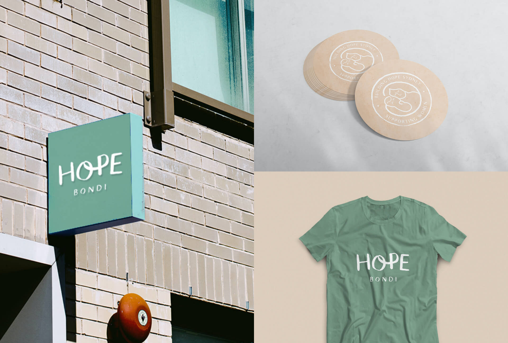
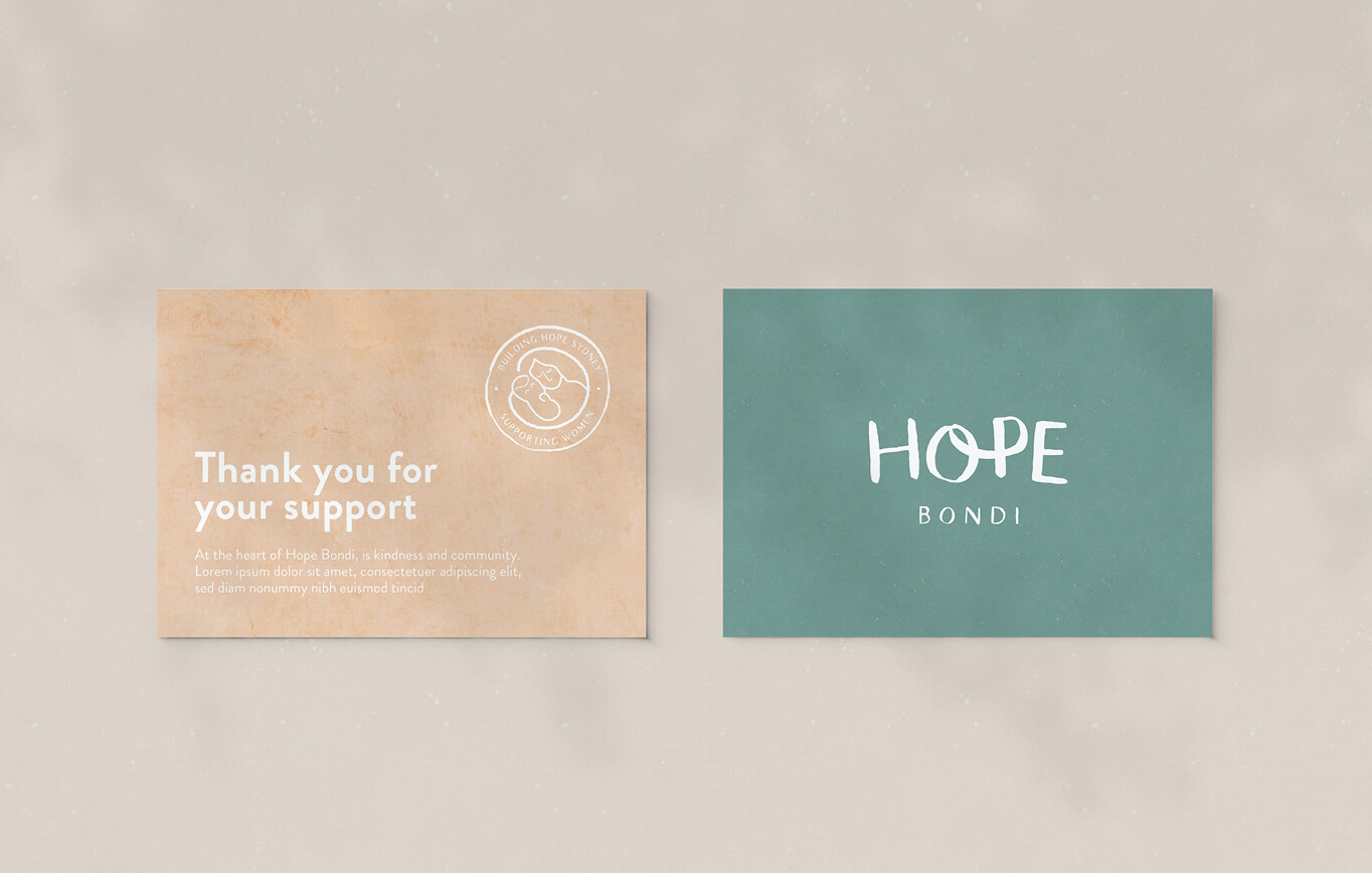
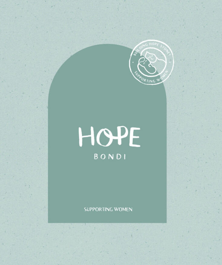
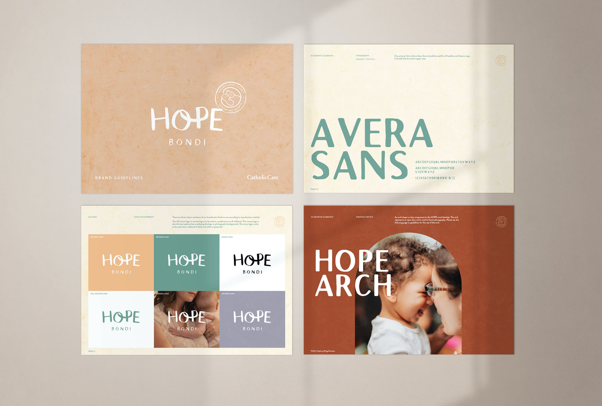
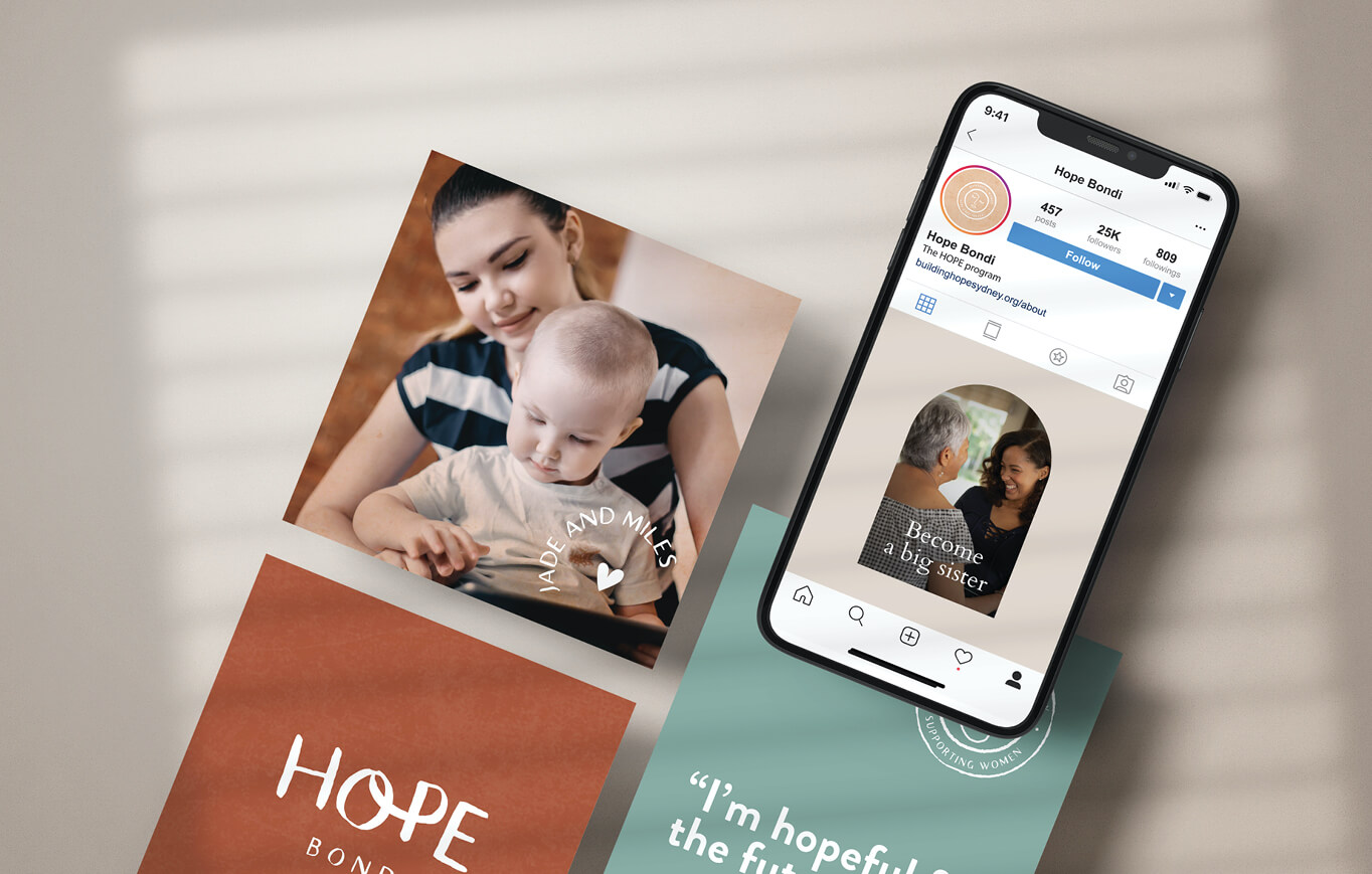
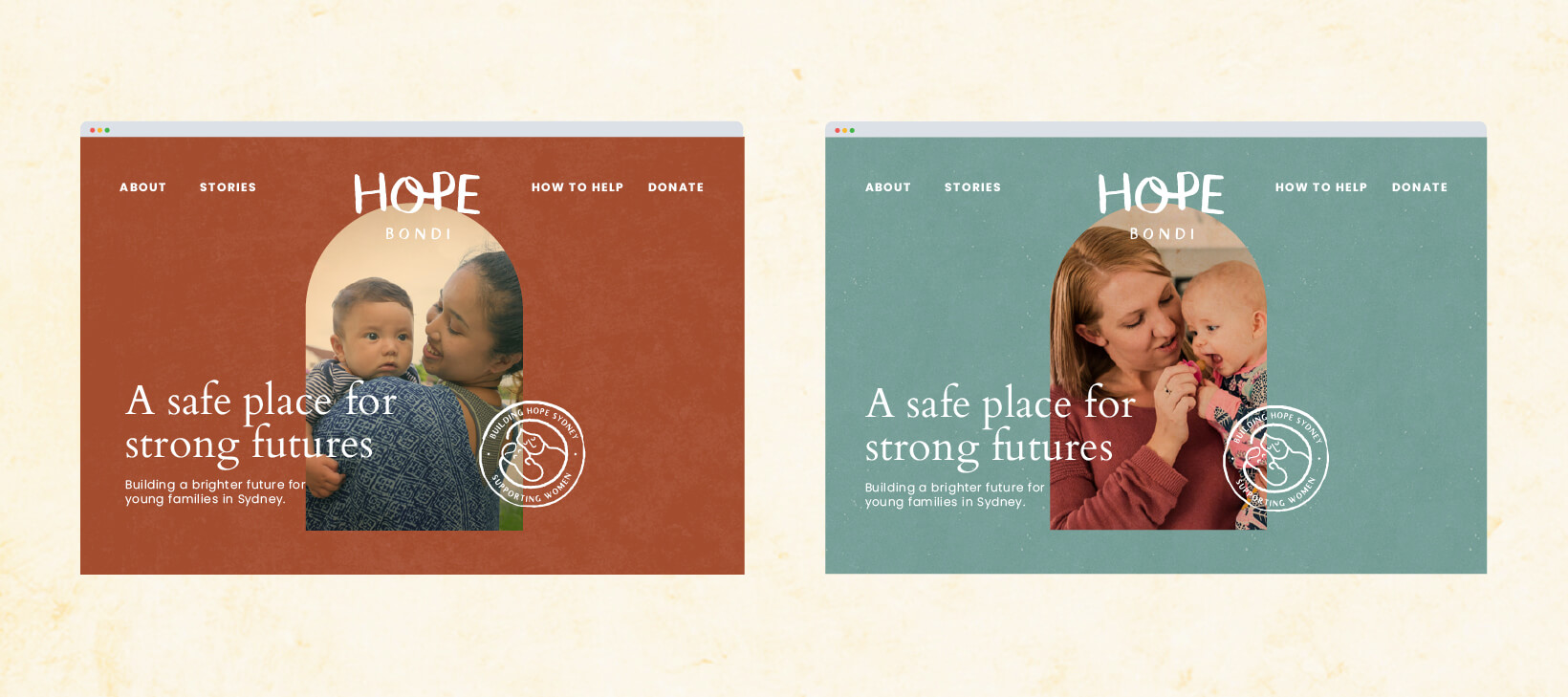
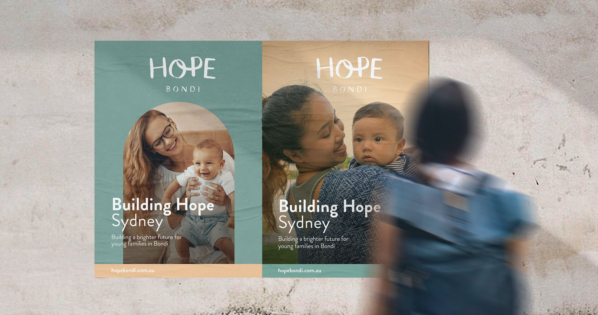
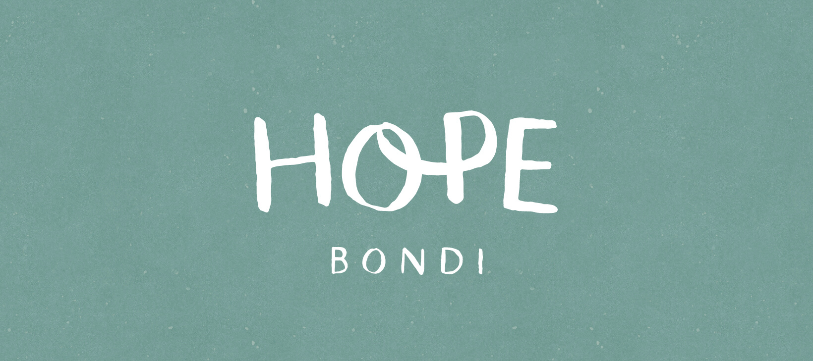
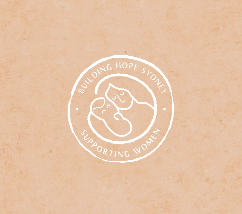
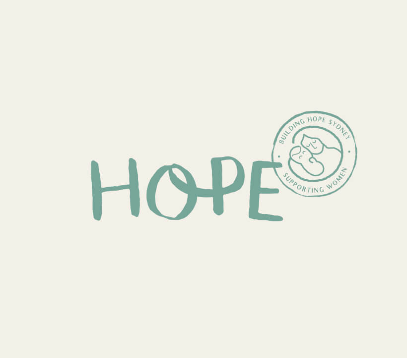
Organic and handcrafted elements are at the core of this brand, which is elevated by a clean minimalism. The logo uses a handwritten font with bespoke lettering with the looped letters representing connectedness and support. The use of uppercase creates a sense of certainty and command which is softened by the more casual typography, with the brand illustration adding an extra dimension to the overall aesthetic.
“I have worked with Kylie and Three Blocks Left on several projects. Kylie brings with her strategic insights to aid develop of all briefs and creative tasks. What I most like about working with them is their ability to be able to see beyond the brief and create a response that challenges the “cookie cut” approach to projects. With the support of Kylie and the team of Three Blocks Left we’ve been able to move the dial on our campaigns significantly”
JONATHAN MELROSE-RAE, GENERAL MANAGER