HOBSONS BAY MUSIC ACADEMY
Branding for Hobsons Bay Music Academy.
THE SITUATION
The brief for Hobsons Bay Music Academy was to showcase their music academy in a positive and exciting way while including references to their beach location and community. The new brand needed to appeal to the young demographic of their students but be effectively grow the business to adults and performers as well.
THE SOLUTION
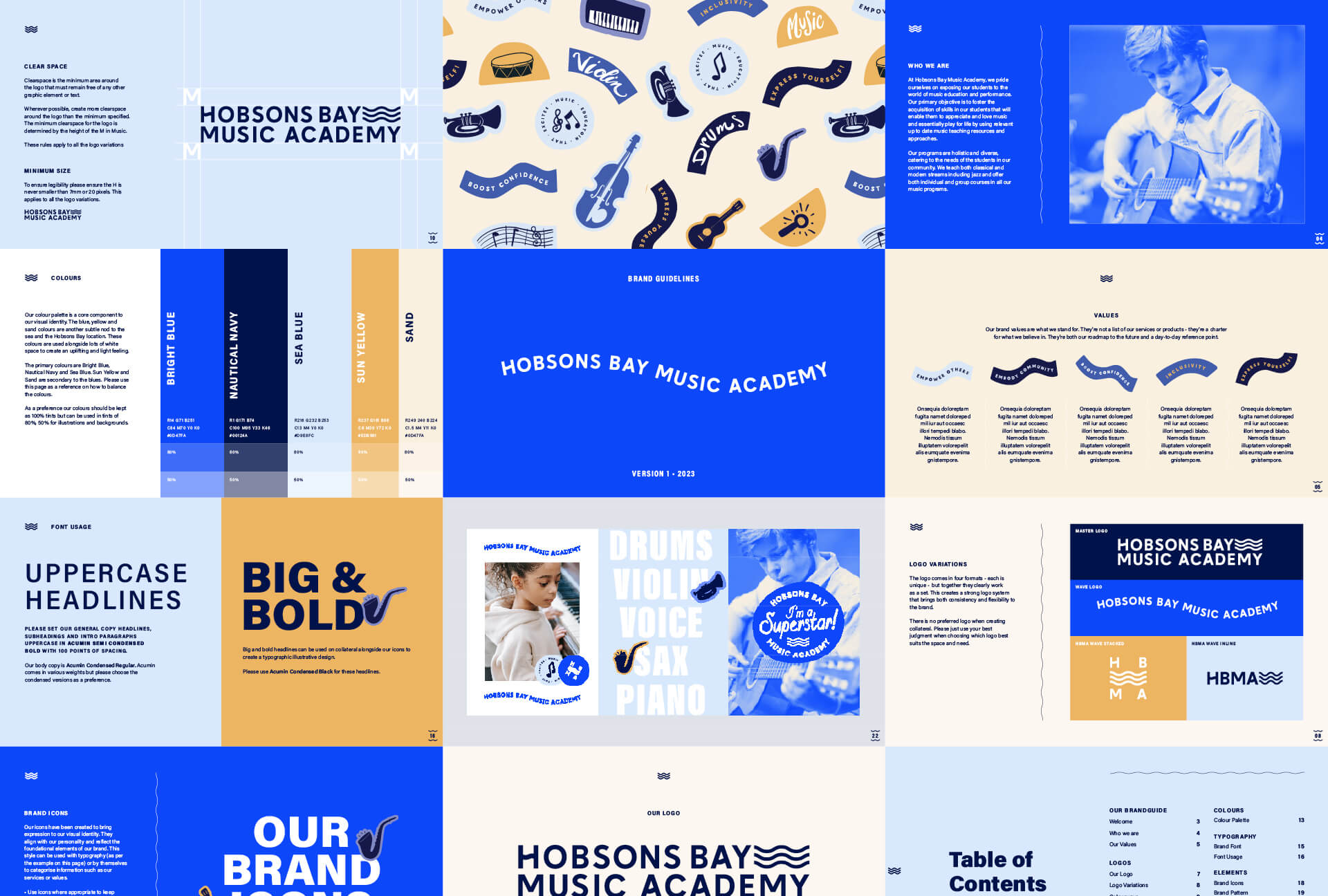
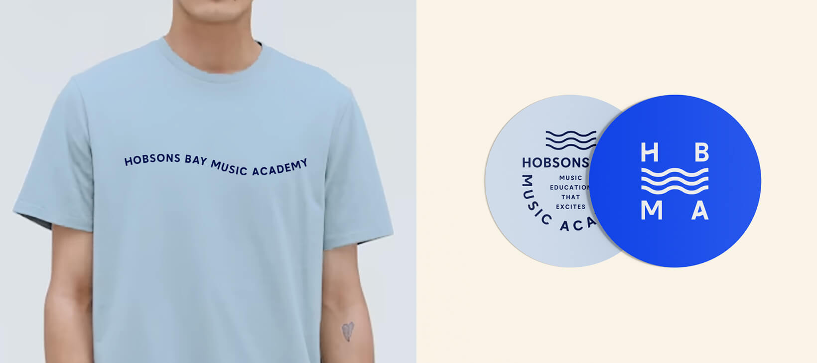
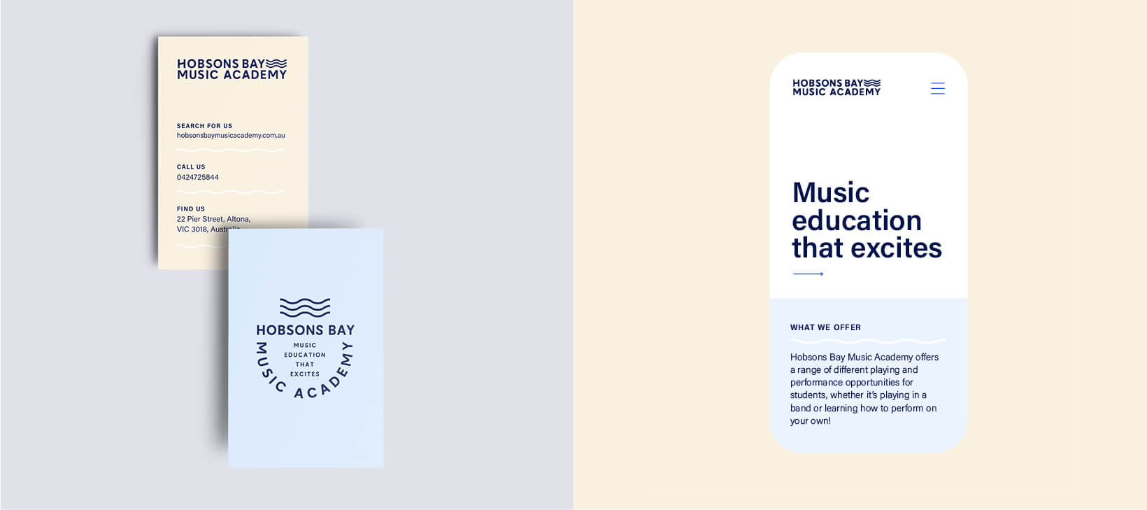
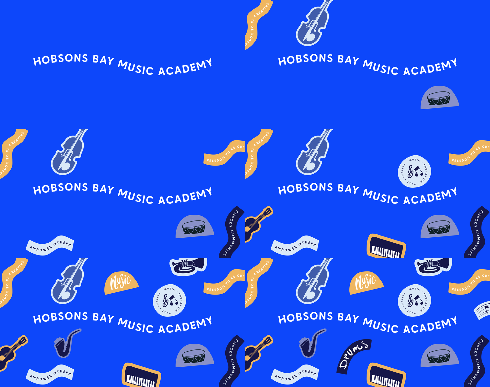
We created a harmonious new brand for Hobsons Bay Music Academy that captures both music and the ocean. The resolutions strength lies in simplicity and attention to the small details in the designs. Such as the wave element that is replicated in the letterforms of the logo.
The colour palette is made up of blue’s and sand colours – another subtle nod to the Hobsons Bay location. These colours are used alongside lots of white space to create an uplifting and light feeling.
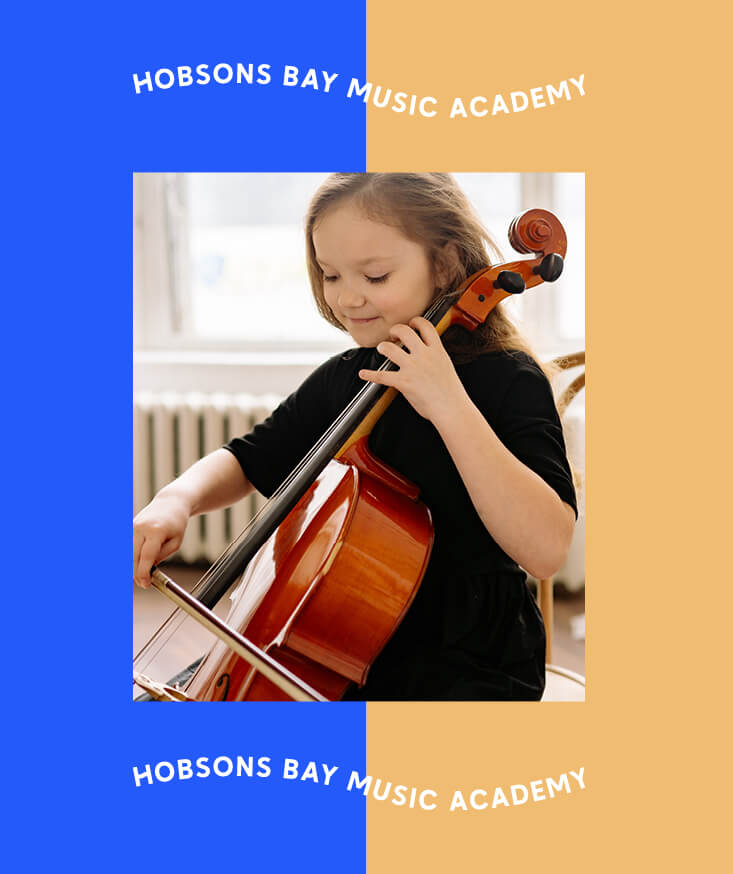
Overall the brand is modern, timeless and versatile. It feels friendly and warm with broad appeal to both children and adults.
