CONTENT REBELS
Content Rebels are a content marketing agency that create meaningful connections between people and businesses bold enough to step into the future.
THE SITUATION
In just two years, Content Rebels founder, Sarah Spence grew her solopreneur business to managing a staff of 20 people. It was time for the brand and name to reflect that whirlwind journey and the point the business had come. Our mission was to evolve Content Copywriting into Content Rebels with a new brand strategy, key messaging and visual identity that reflected the companies courageous spirit.
THE SOLUTION
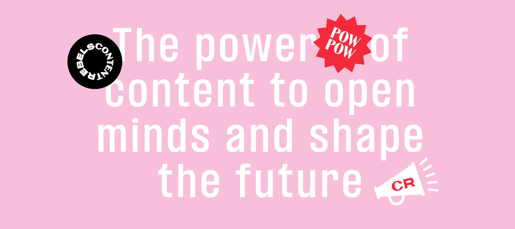
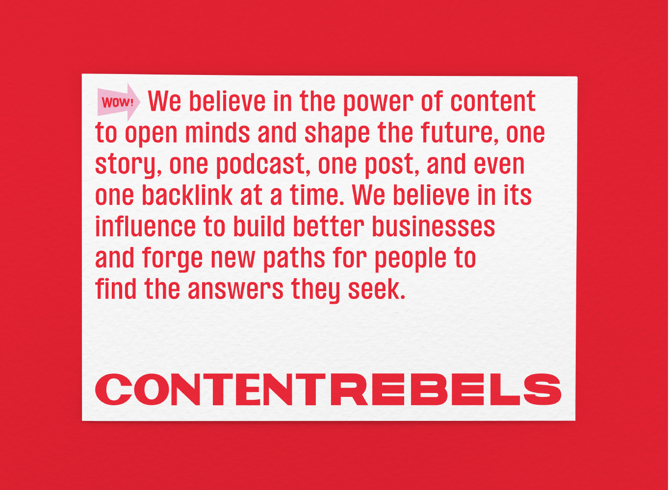
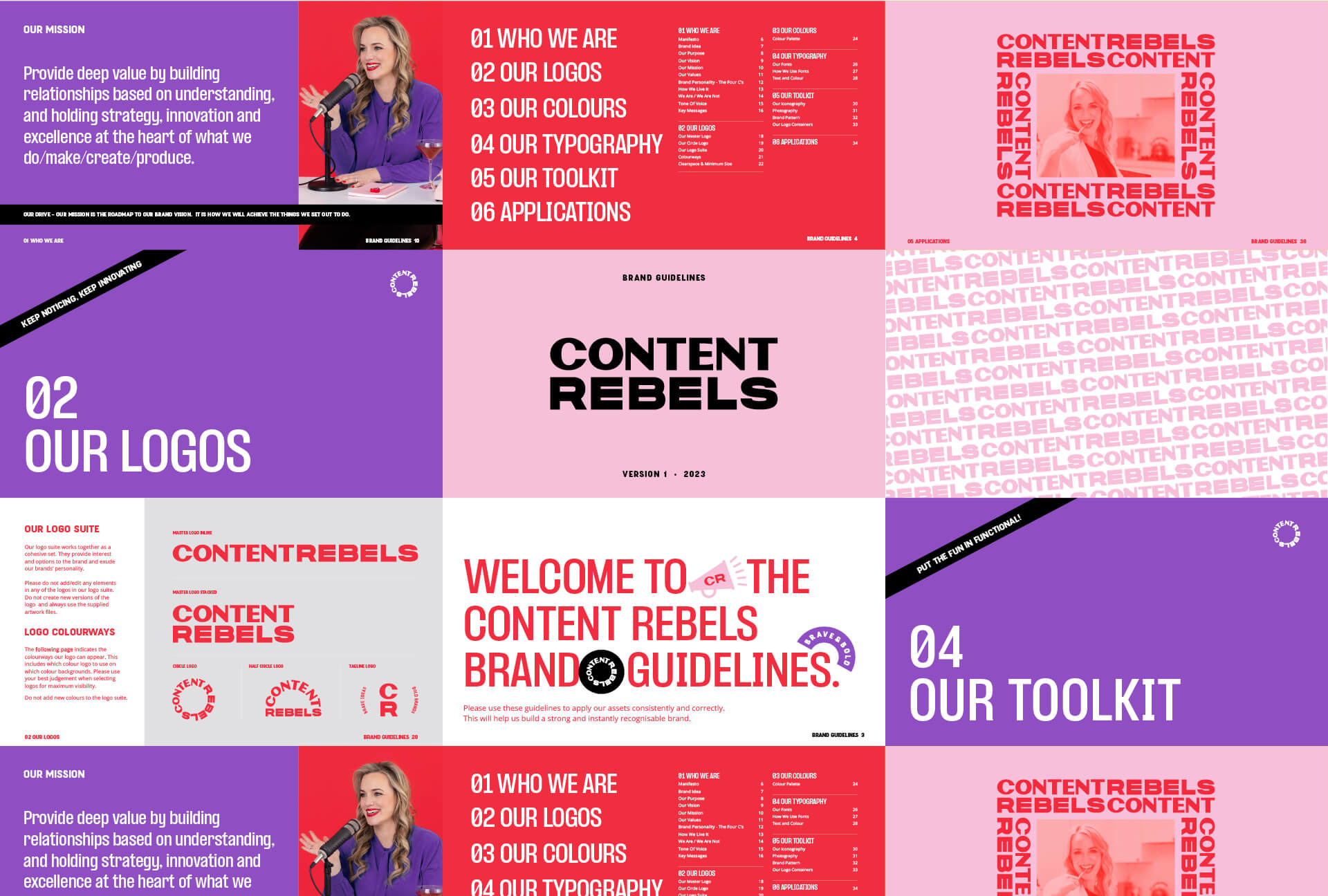
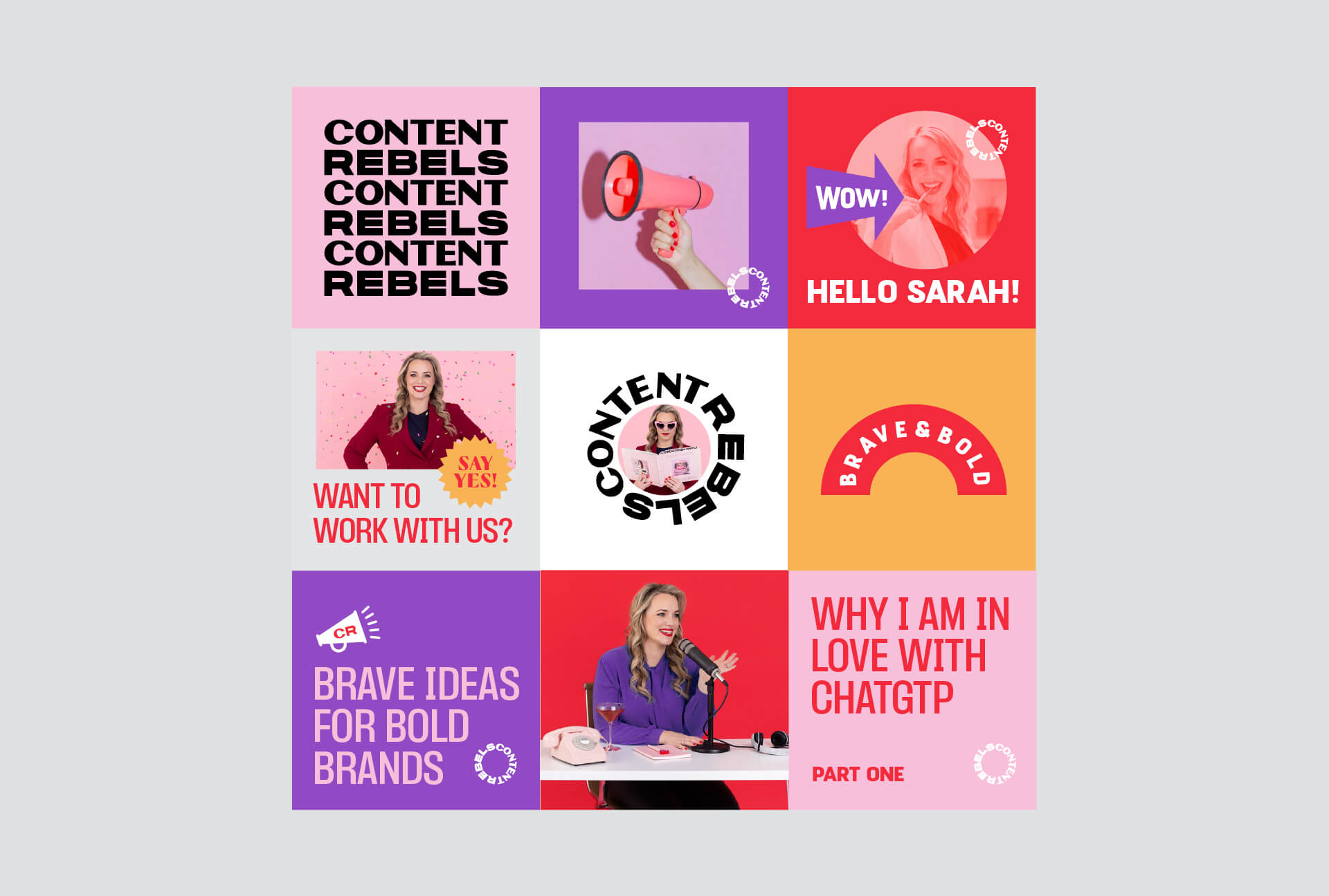
We integrated brand strategy, key messaging and identity design to position Content Rebels as a powerhouse brand stepping into the future of content marketing.
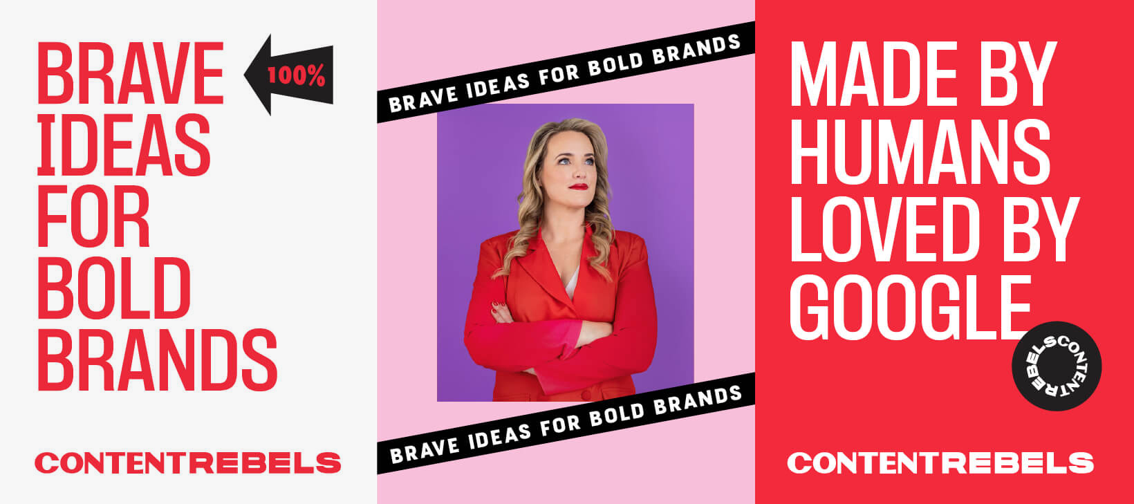
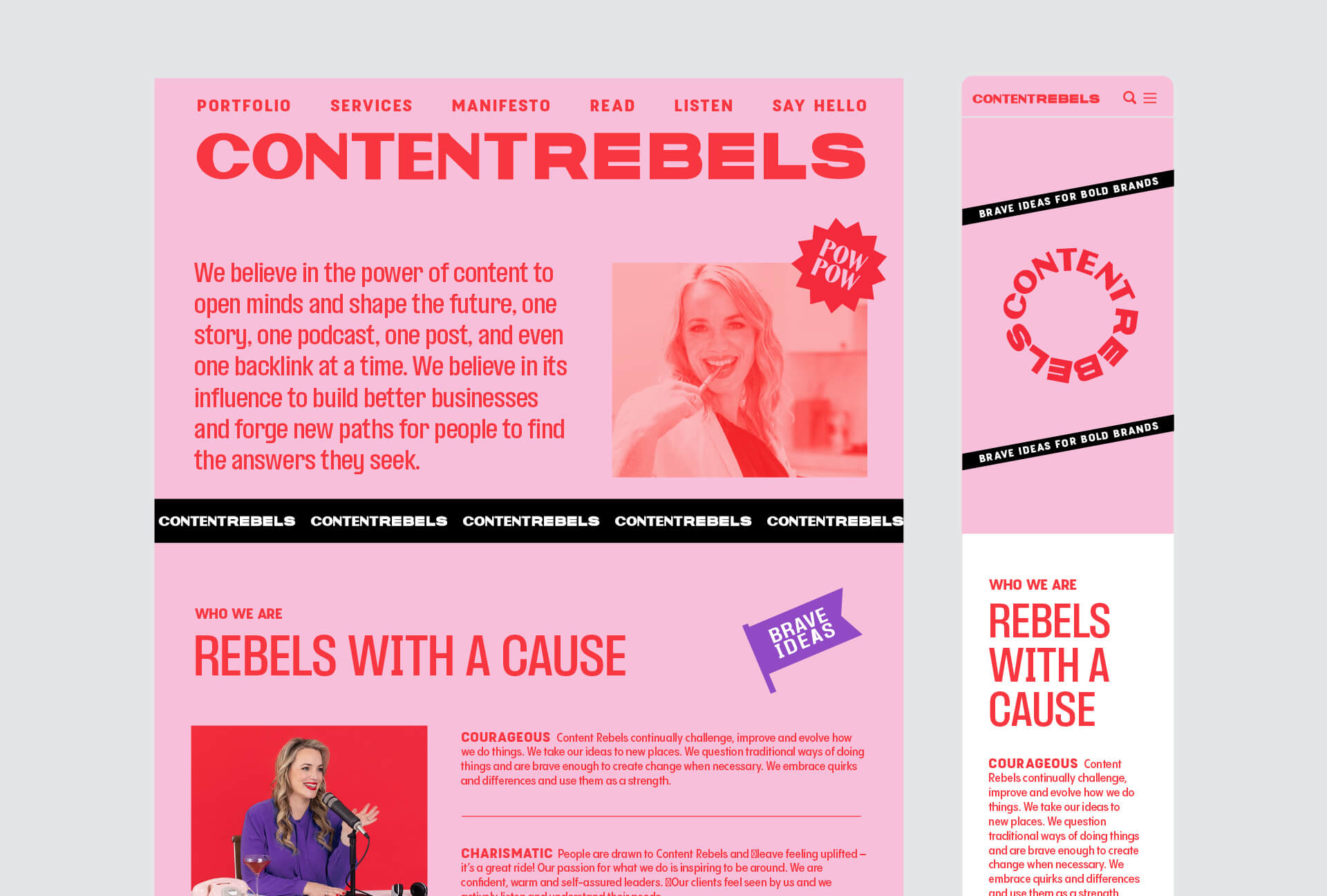
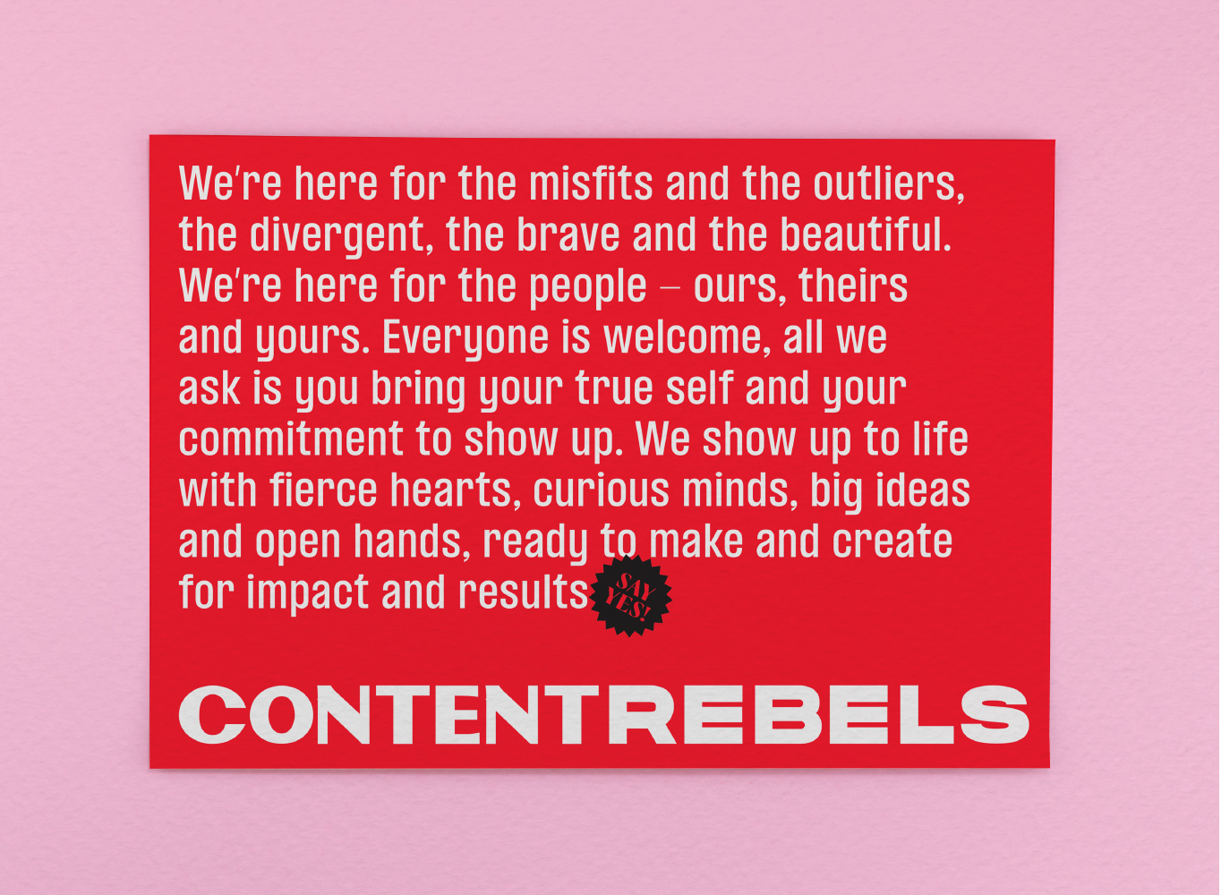
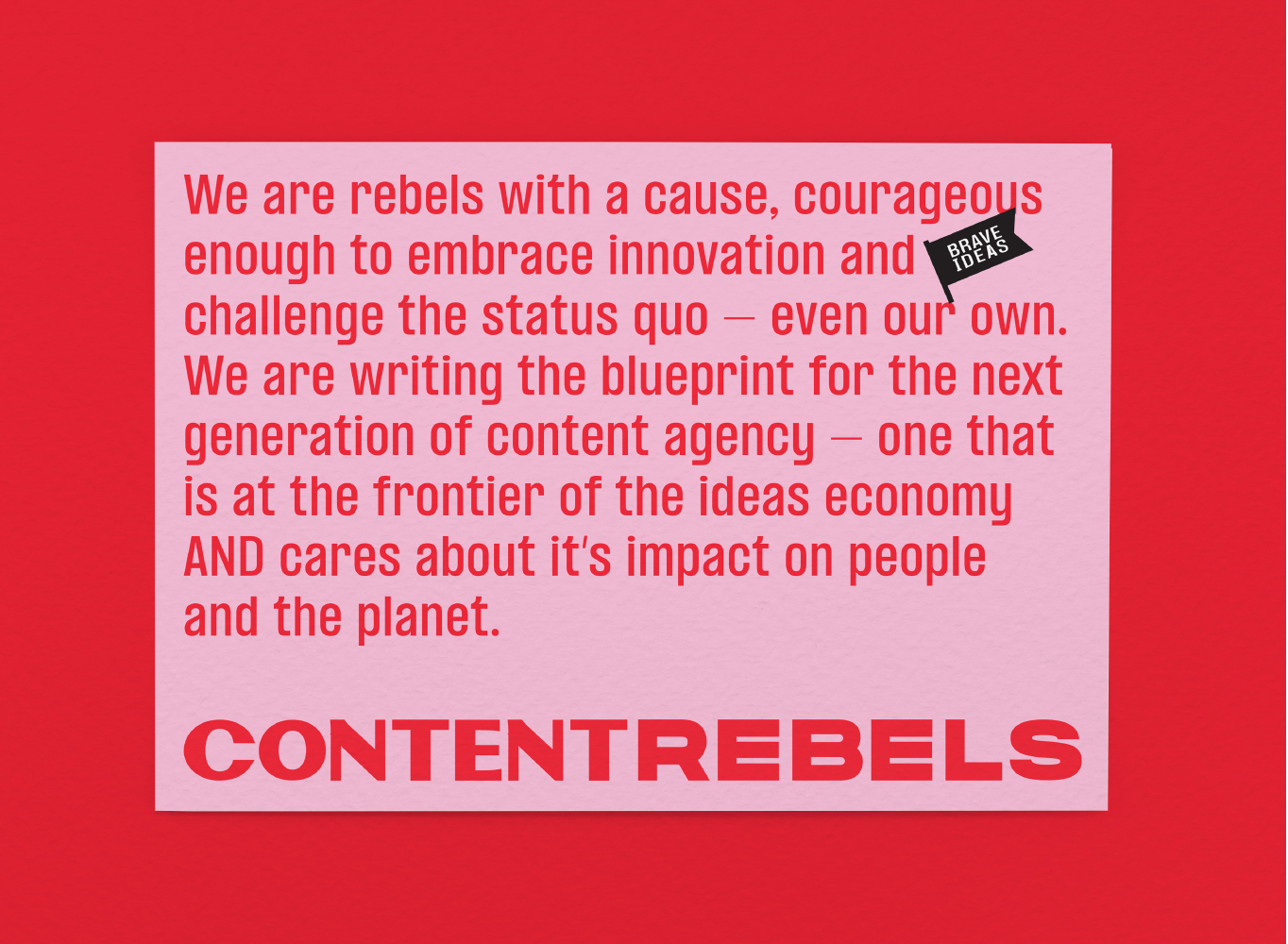
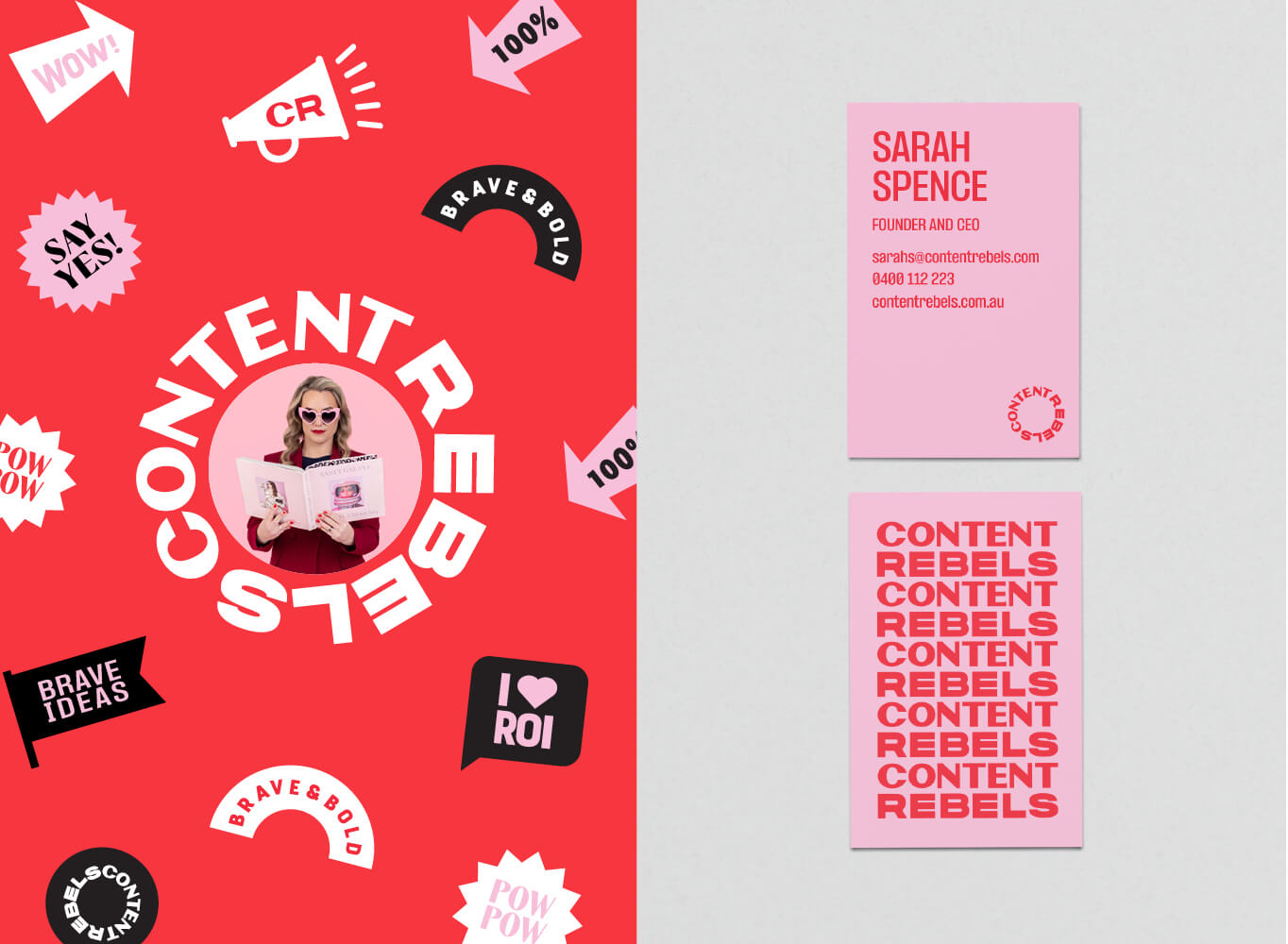
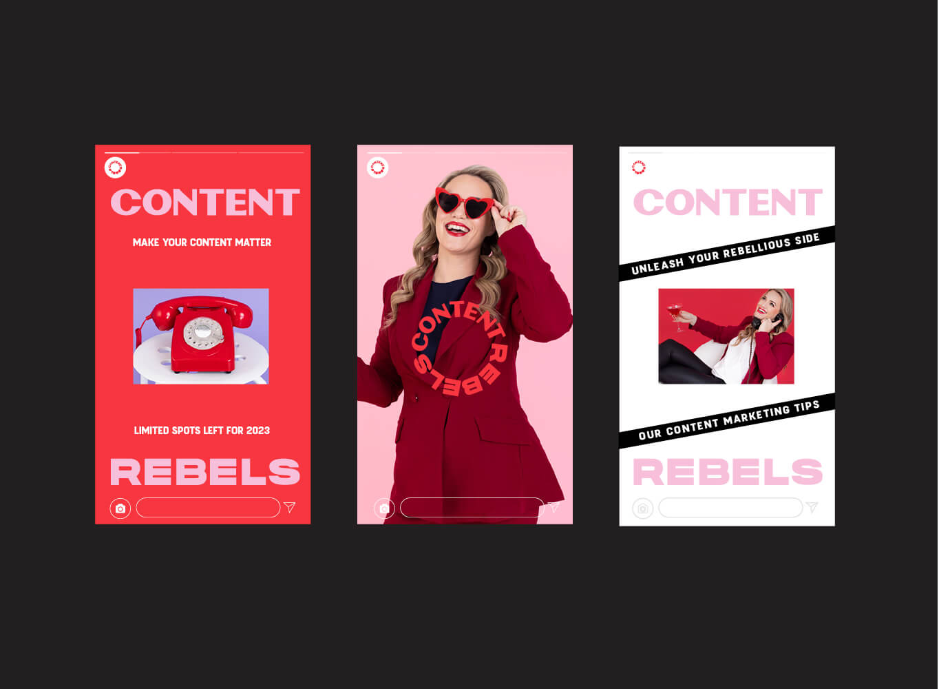
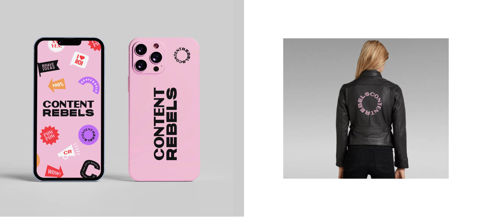
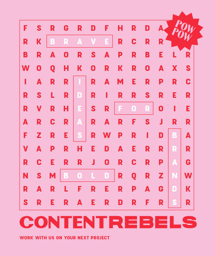
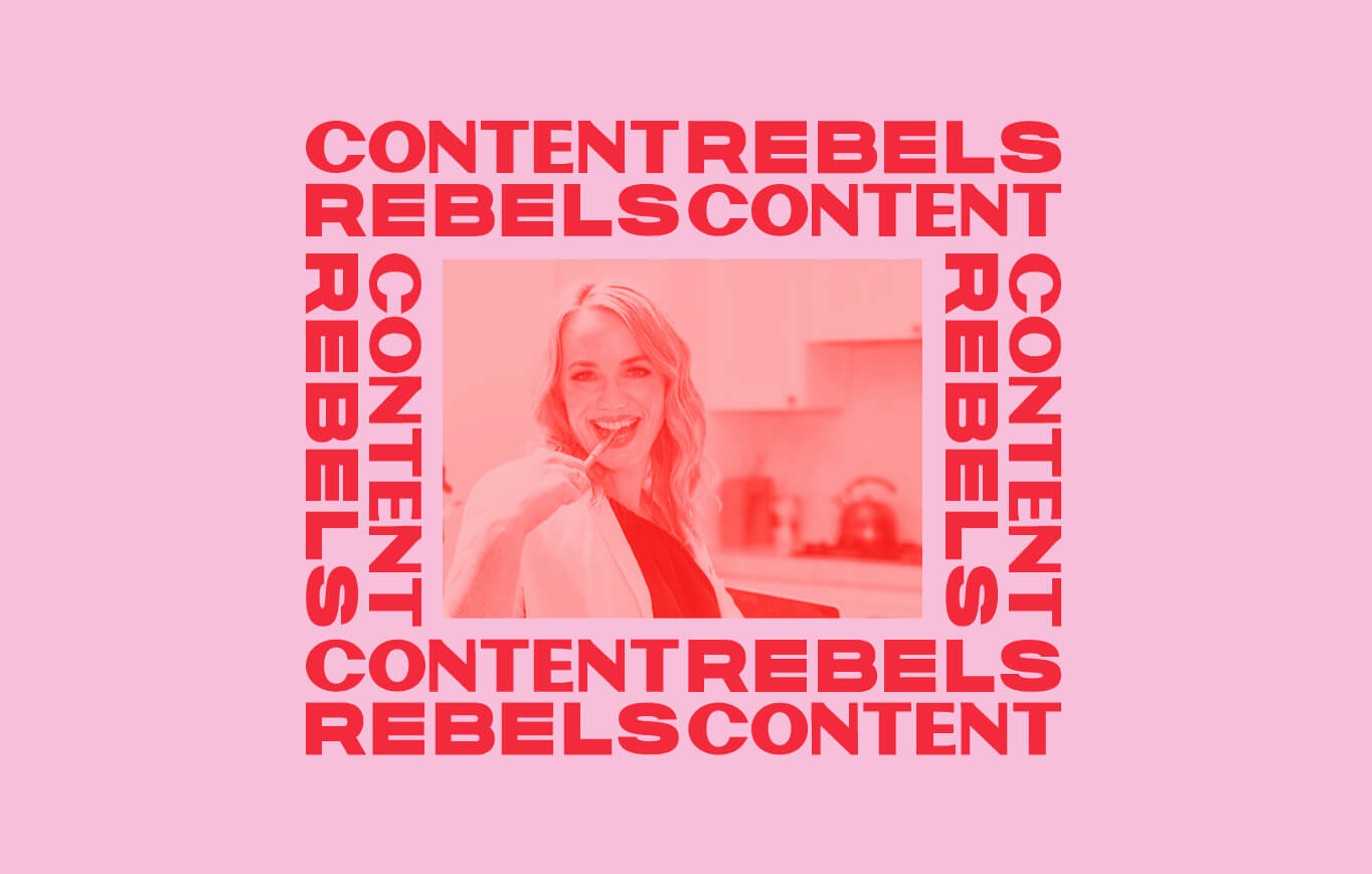
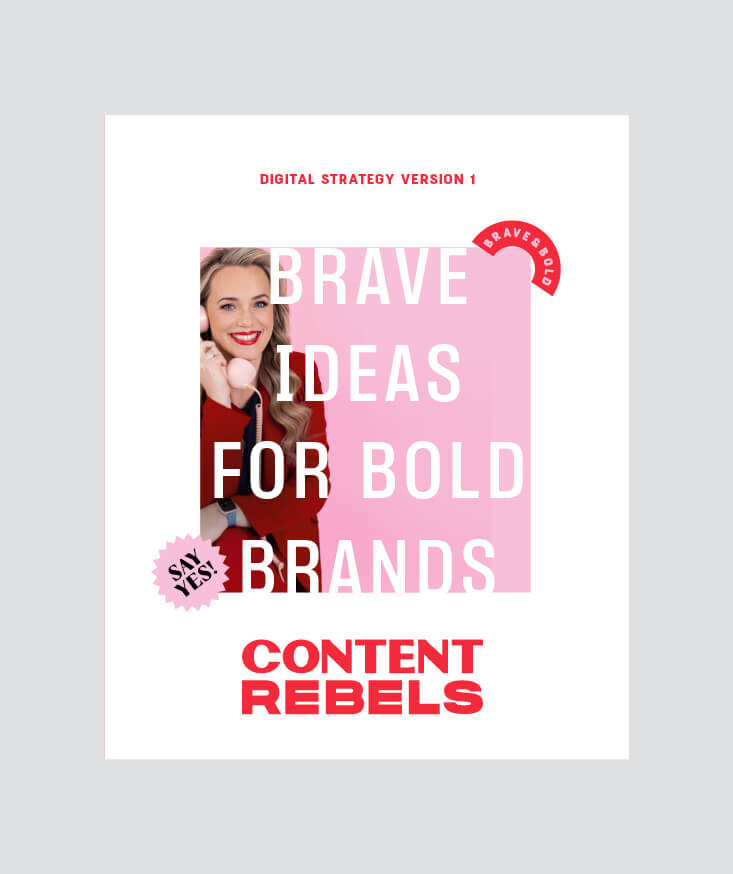
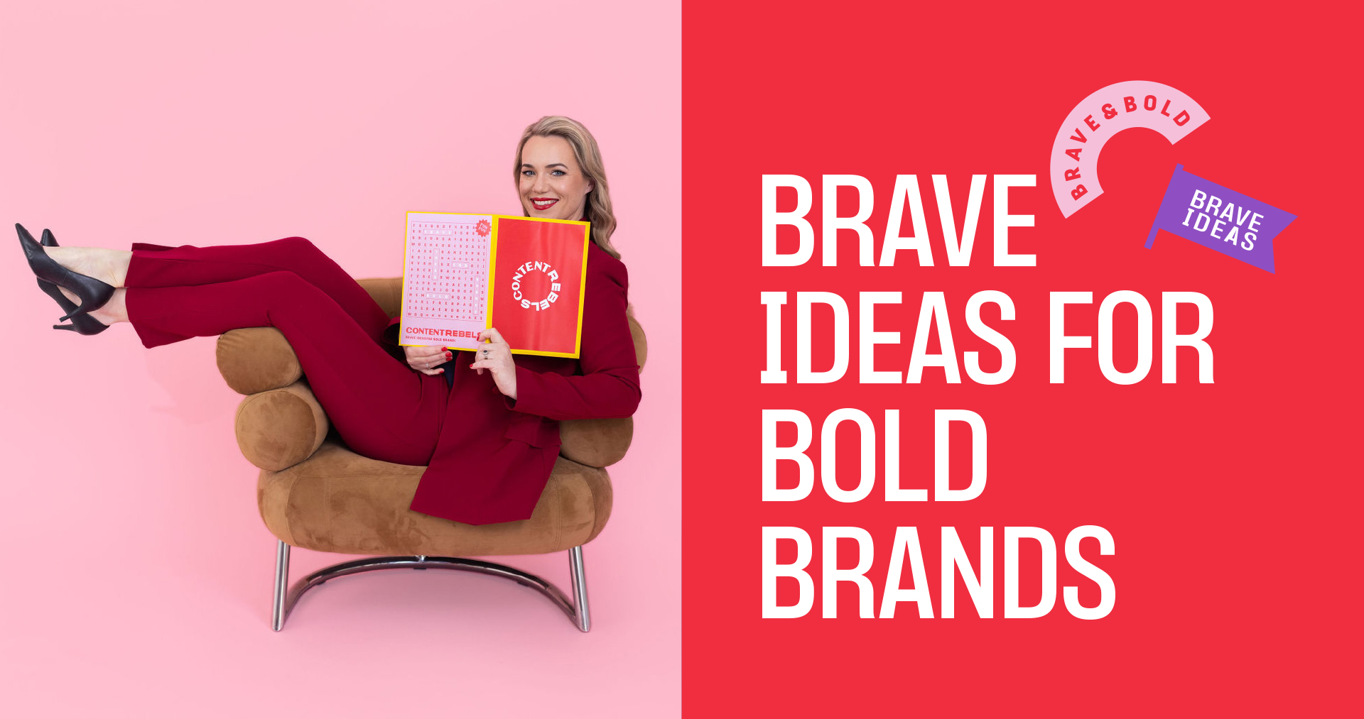
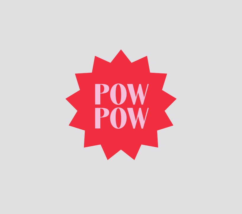
The Brave Ideas for Bold Brands concept runs through all aspects of the organisation. Even down to the red, pink and black colour palette which is a reaction against monochromatic industry norms.
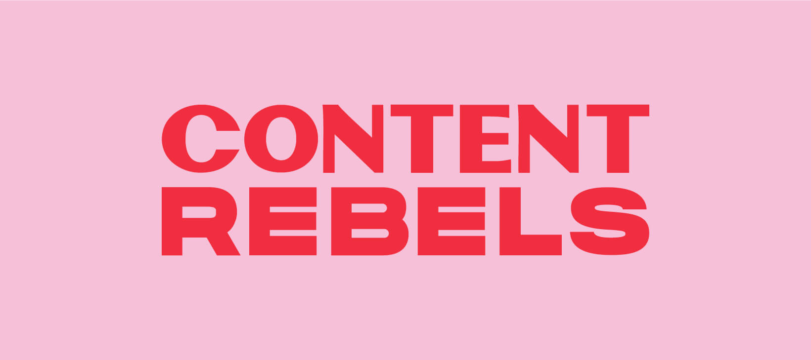
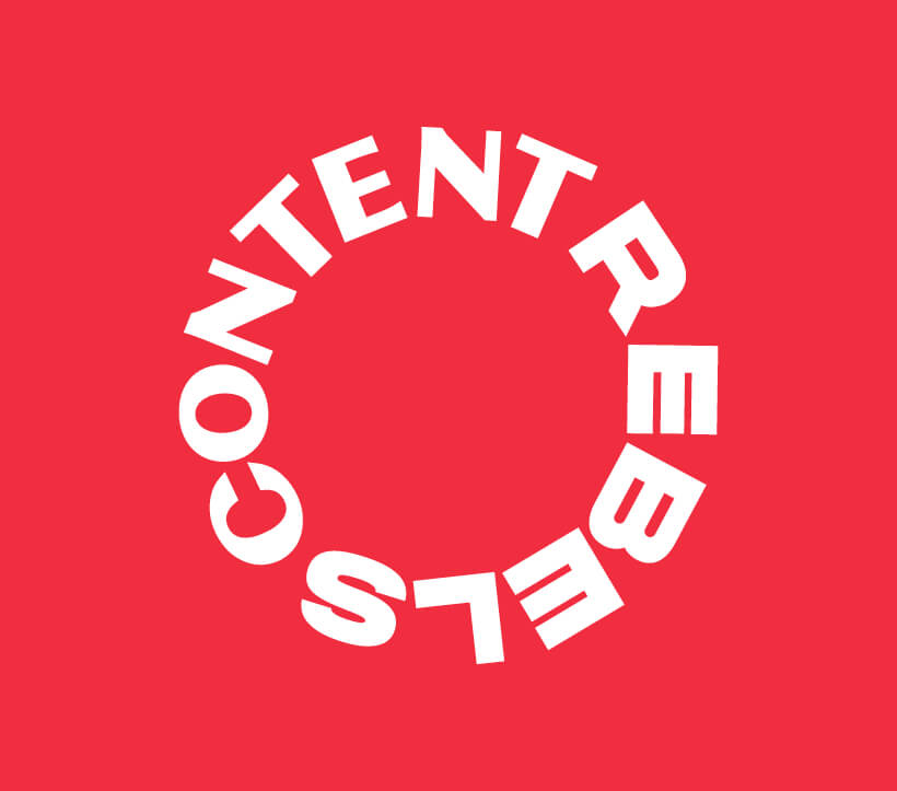
The wordmark logo balances a more traditional san serif for ‘Content’ with the blockier bold font used for ‘Rebels’. This is a conceptual realisation of the service offering and values of the business. Symmetry and balance has been carefully considered, with the letter heights being the same and allowing the logo to create shapes and patterns.
This brand oozes with the charisma and confidence to get heads turning and people talking. It takes bravery to be different but Content Rebels have the momentum and attitude to do it. It is a brand to feel proud of and one that can continue to evolve into the next era of the business as the Content Rebels.
“Three Blocks Left understood who we are are from the inside out. It was such an amazing experience having our vision translated into a brand strategy and new visual identity, we even (literally) shed some tears of joy!”
SARAH SPENCE, CEO
CONTENT REBELS