ANOKHI DENTAL
A brand that actually makes you want to visit the dentist.
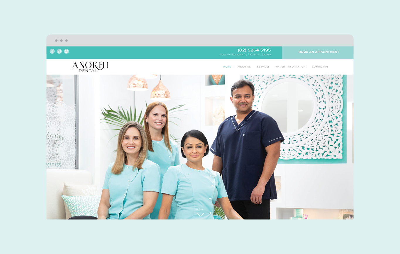
THE SITUATION
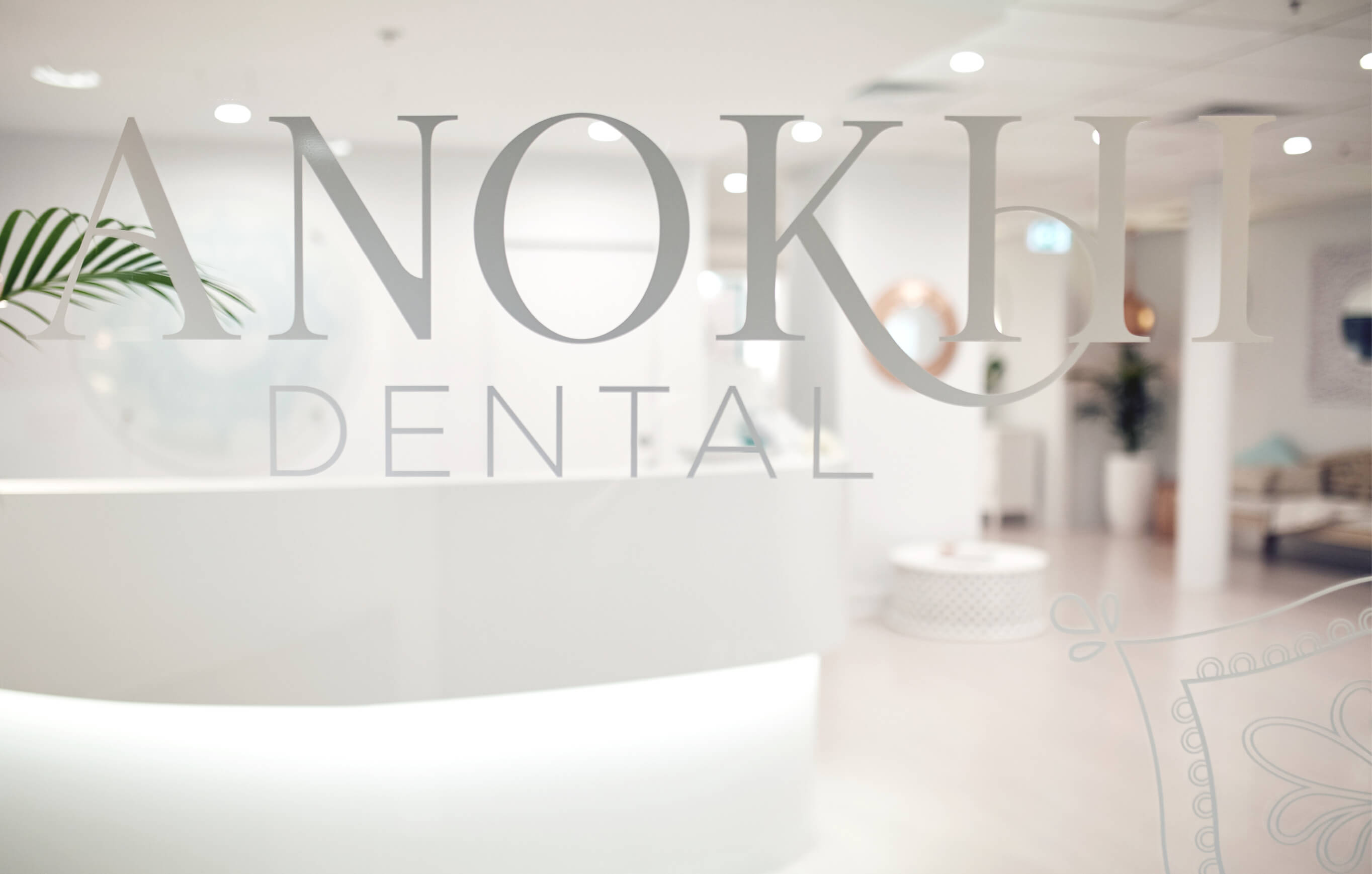
Anokhi Dental is forged from a passion for integrated health and treating patients as unique and individual. The practice provides oral healthcare with a holistic approach, based on ayervedic principles, with an emphasis on working as harmoniously with your body as possible. They asked us to craft an identity that would visually represent their philosophy and approach to their community.
THE SOLUTION
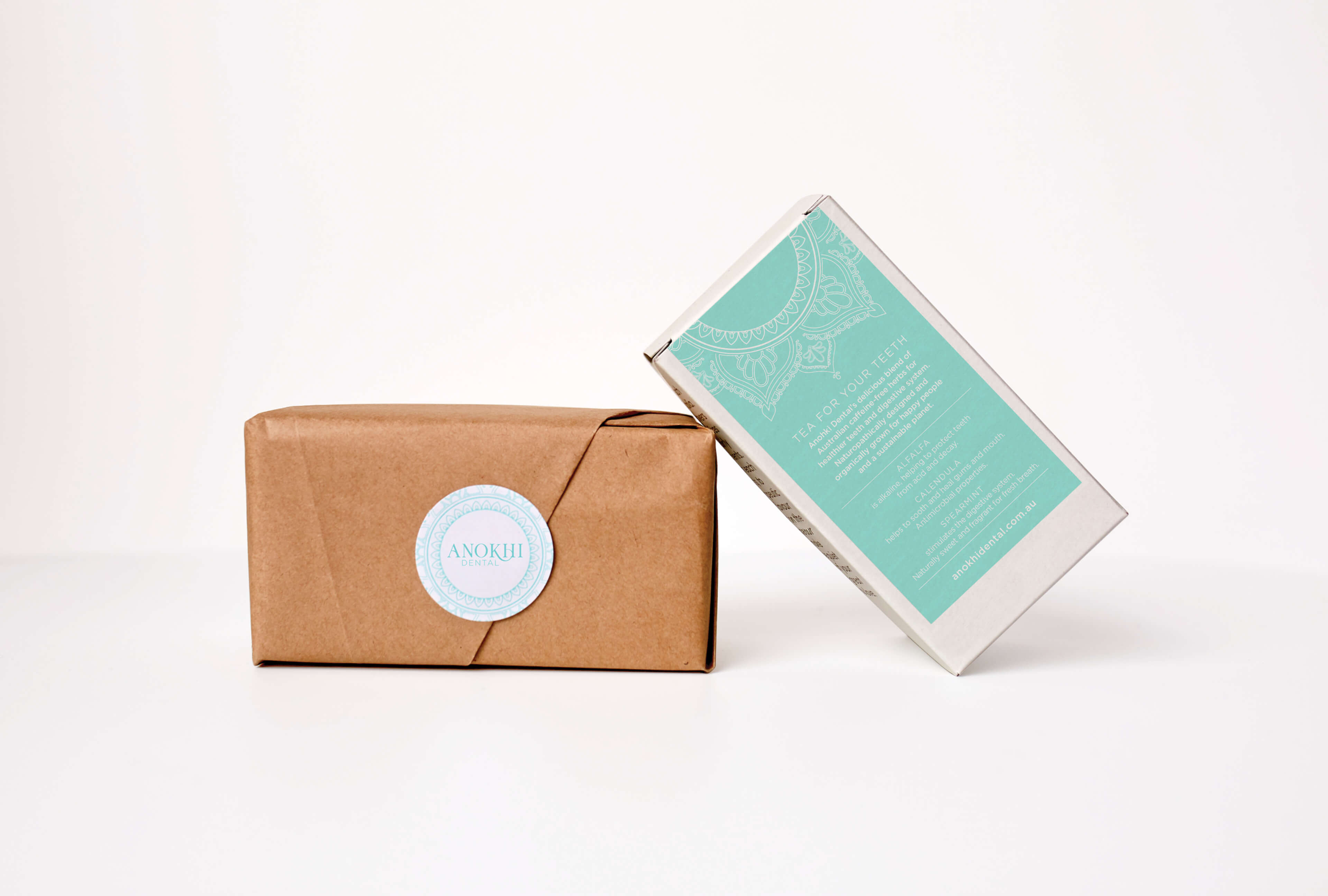
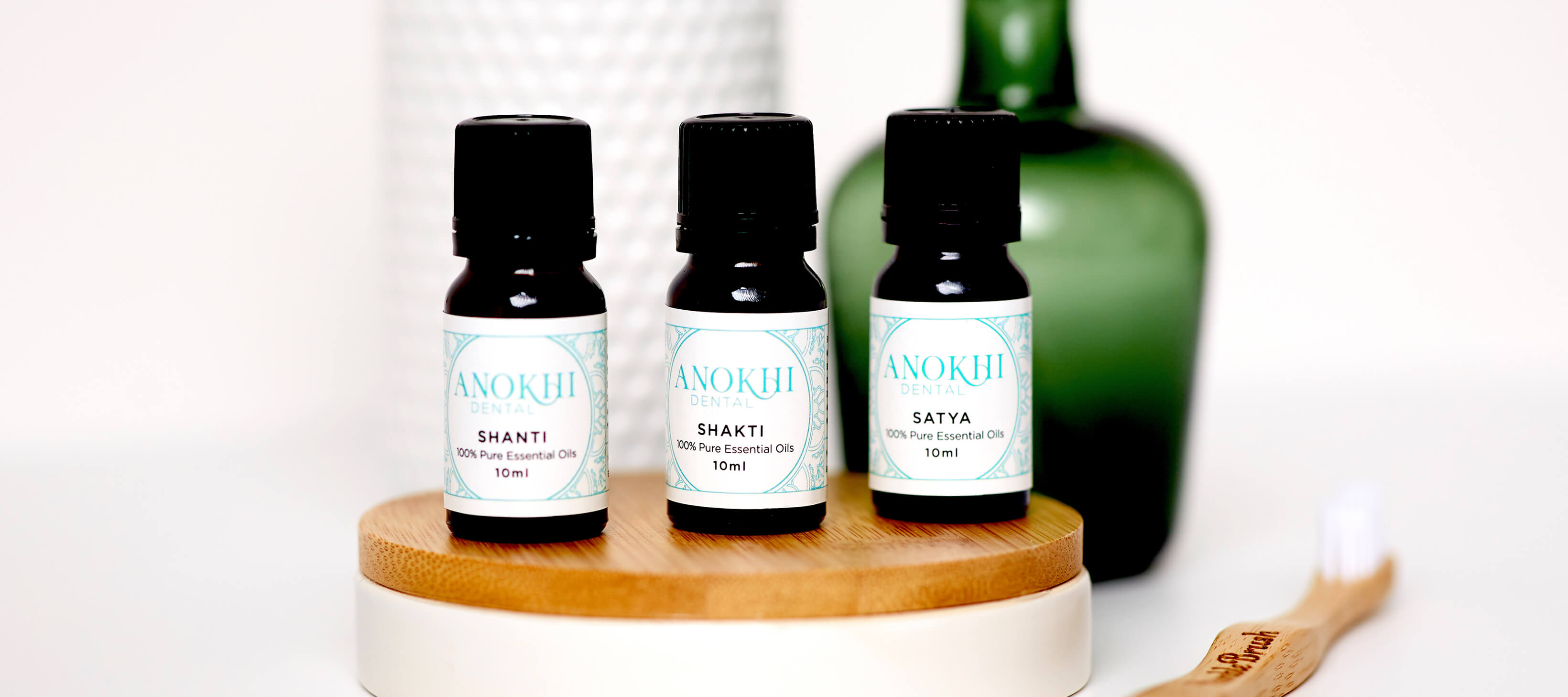
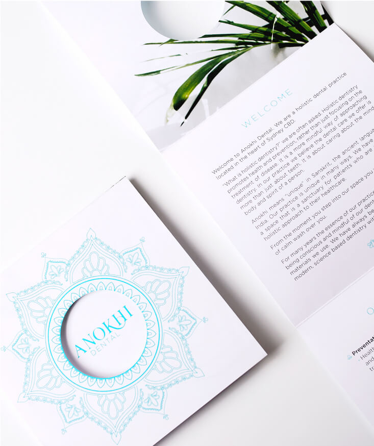
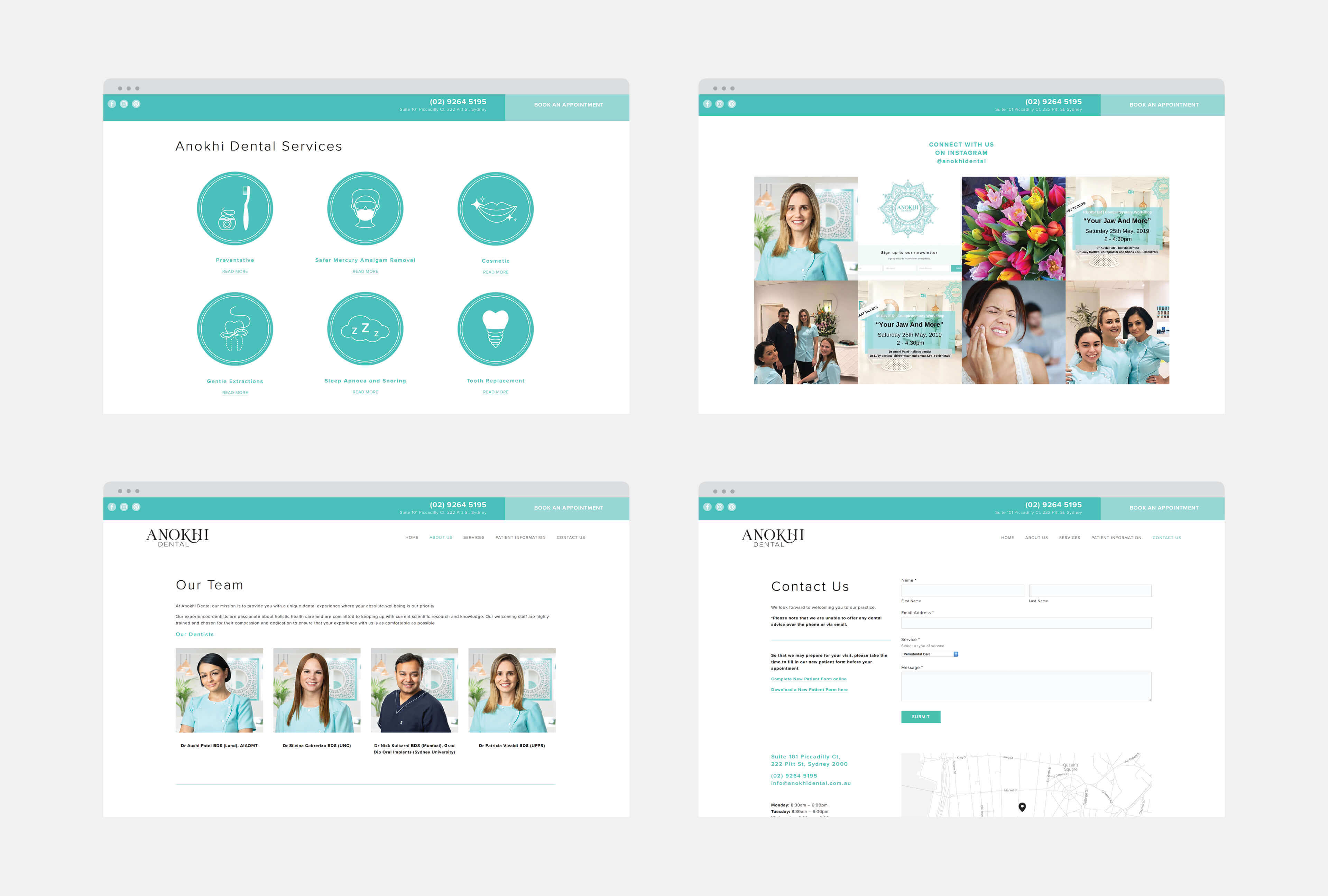
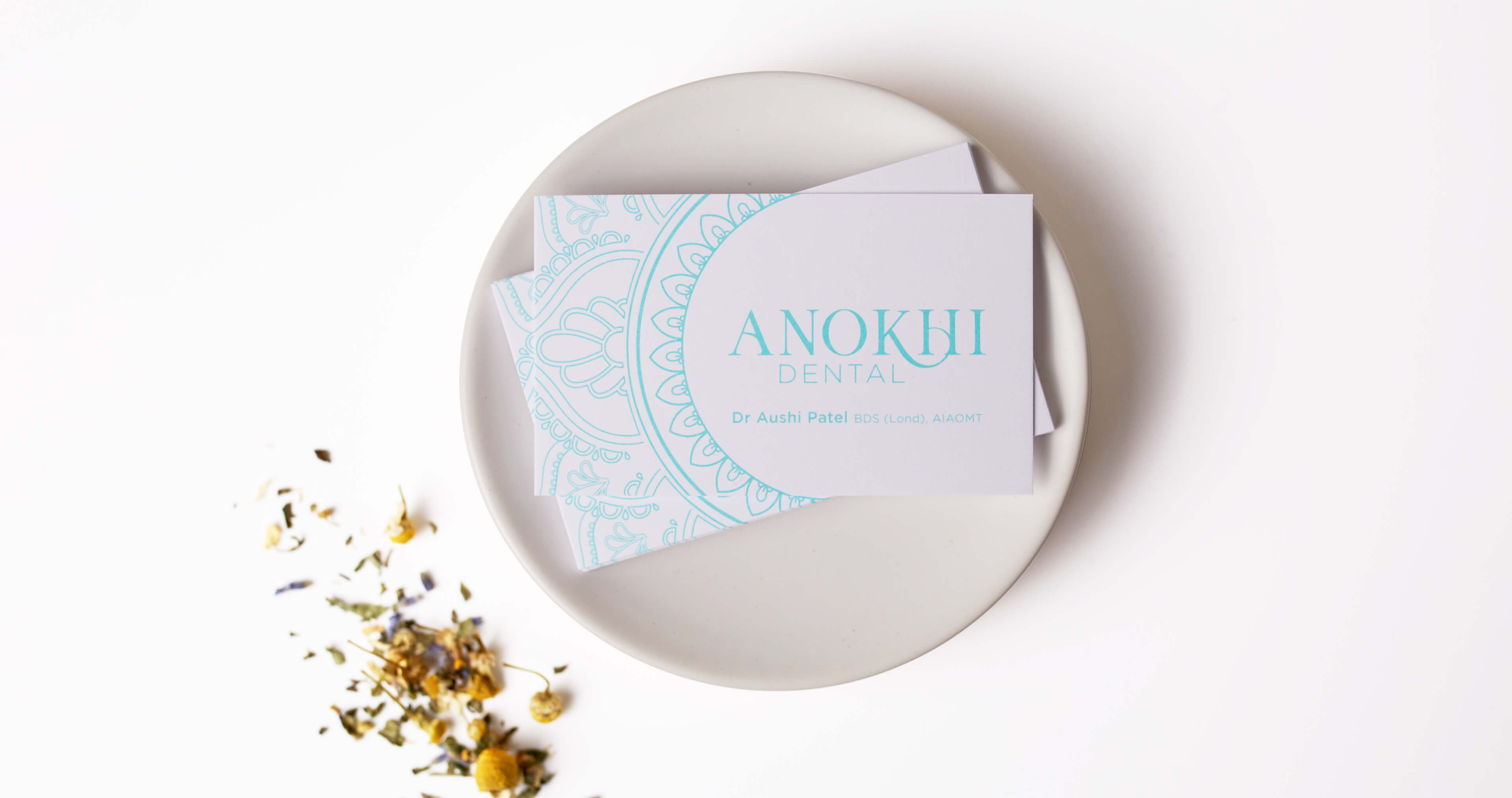
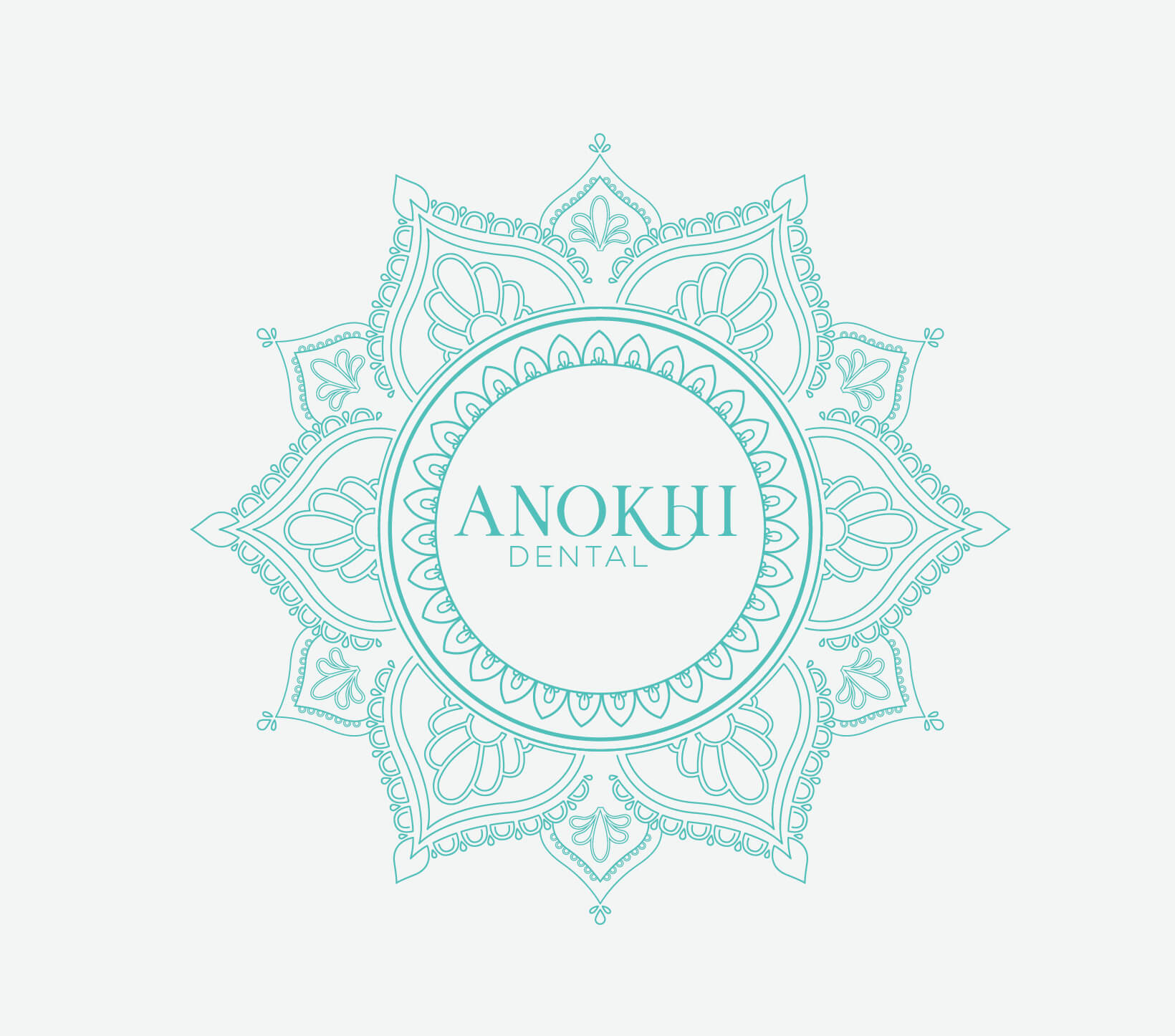
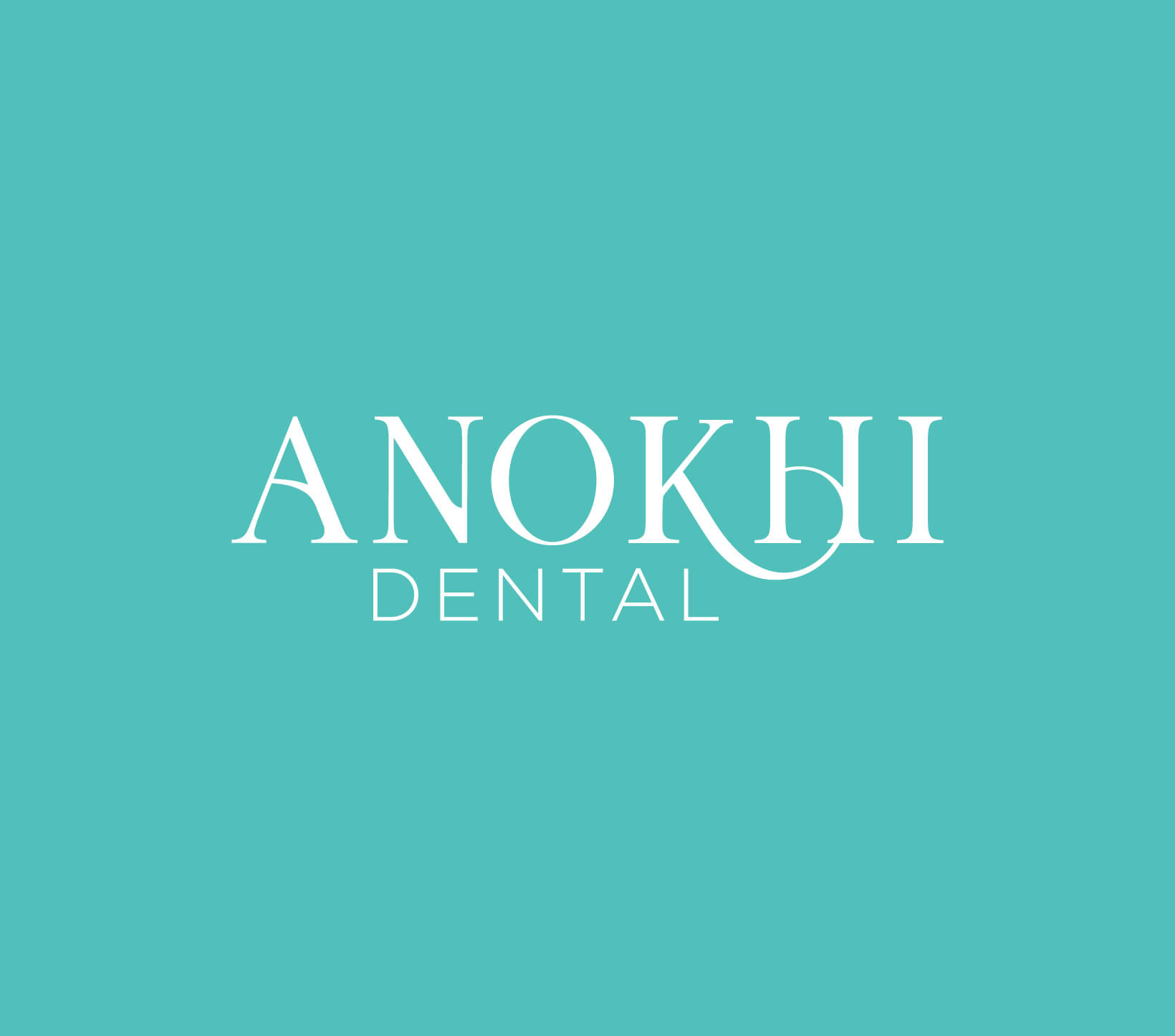
The word Anokhi is Indian in origin meaning unique. From this starting point, we developed the brand, inspired by the visual cues of Indian ayuervedic philosophy. Ensuring the logo is at once elegant and grounded, the custom typography loops the letterforms to reflect the holistic approach. To layer the brand we developed a bespoke mandala, to envelope the logo in it’s master form but flexible to be dissected into different parts to shapeshift to various applications demanded by the business from the website, to oil labels to signage.
“I have worked with Three Blocks Left for the past 12 years and am a very happy client. They have been involved in two rounds of a major business rebrand for me and will be the creative team behind another business I will be launching next year.
I love working with them because of their creative intuition, efficiency and style. They have always delivered above and beyond what I expect and are highly professional”
AUSHI PATEL, FOUNDER
ANOKHI DENTAL