


SYDNEY COMMUNITY FOUNDATION
Twenty years of connecting philanthropy with grassroots community organisations across Sydney. A growing portfolio of sub-funds, each with their own cause, community and hard-won audience. And a brand system that wasn’t keeping up.
Sydney Community Foundation needed a master brand that could hold it all together, without flattening everything into sameness.
THE CHALLENGE
SCF’s entire value proposition is connection.
Donors to causes.
Philanthropists to grassroots need.
Community to community.
But look at the brand portfolio and you’d never know it. Each sub-fund had grown its own identity organically — which made sense at the time, but created a problem as the portfolio grew. Sub-fund equity wasn’t reinforcing the master brand. The master brand wasn’t lending credibility back to the sub-funds. And with more sub-funds on the horizon, the disconnect could only get worse.
For an organisation whose whole reason for existing is bringing people together, a fragmented brand system was quietly working against everything they stood for.
THE SOLUTION
The answer was in the name. Foundation. Something everything else is built on.
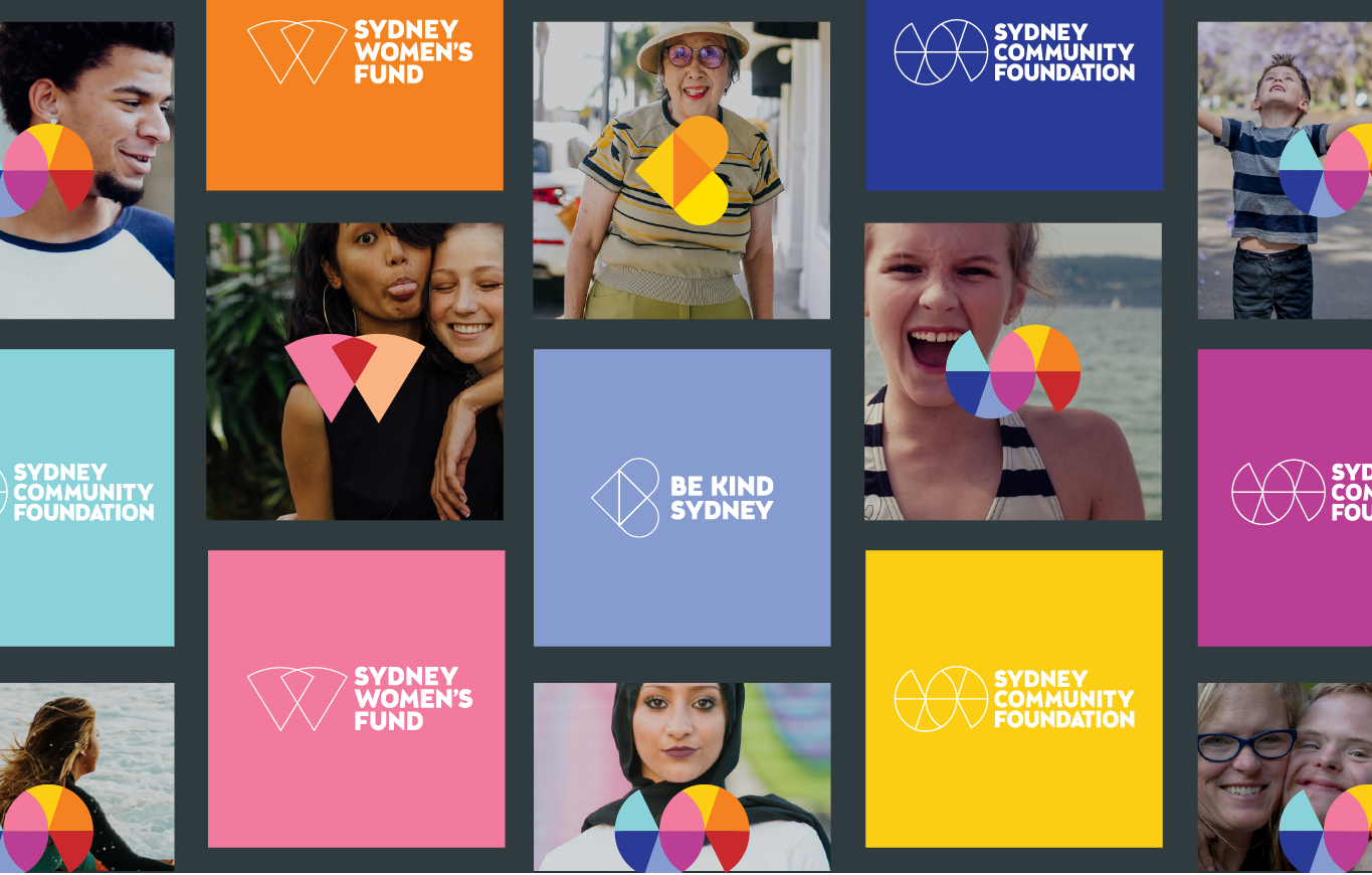
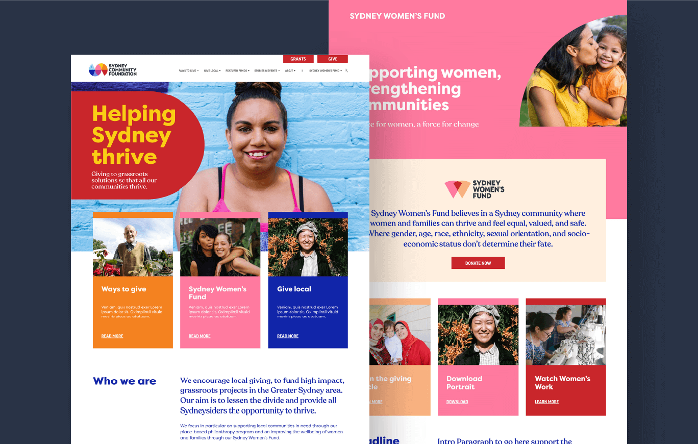
We moved SCF to a branded house/endorsed hybrid model — positioning SCF as the master brand without which no sub-fund would exist, while protecting the equity each sub-fund had already built with its own community.
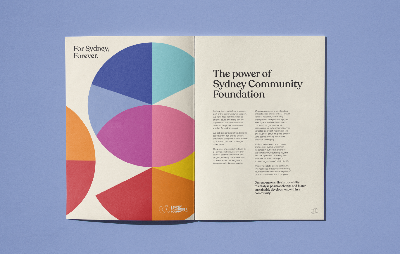
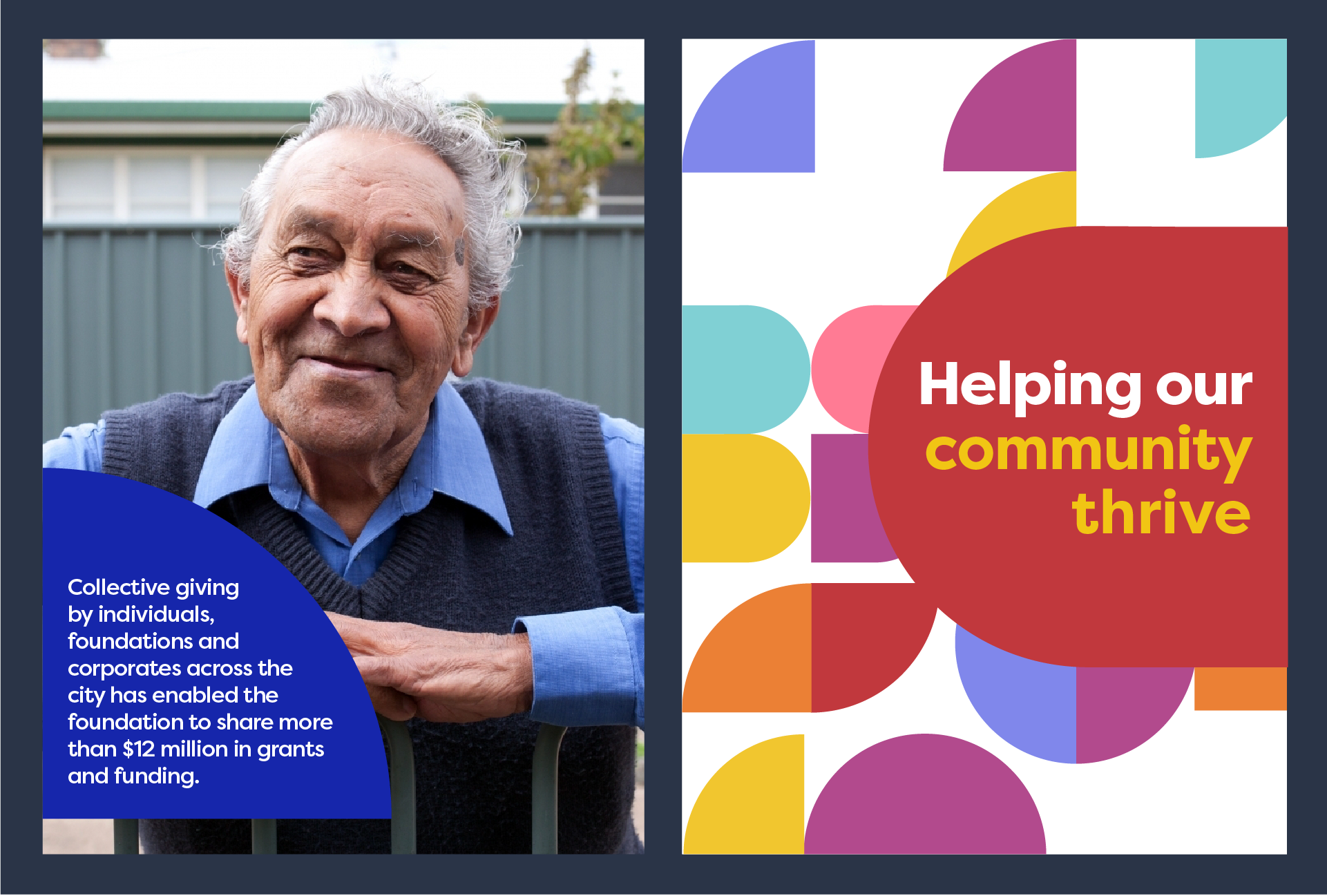
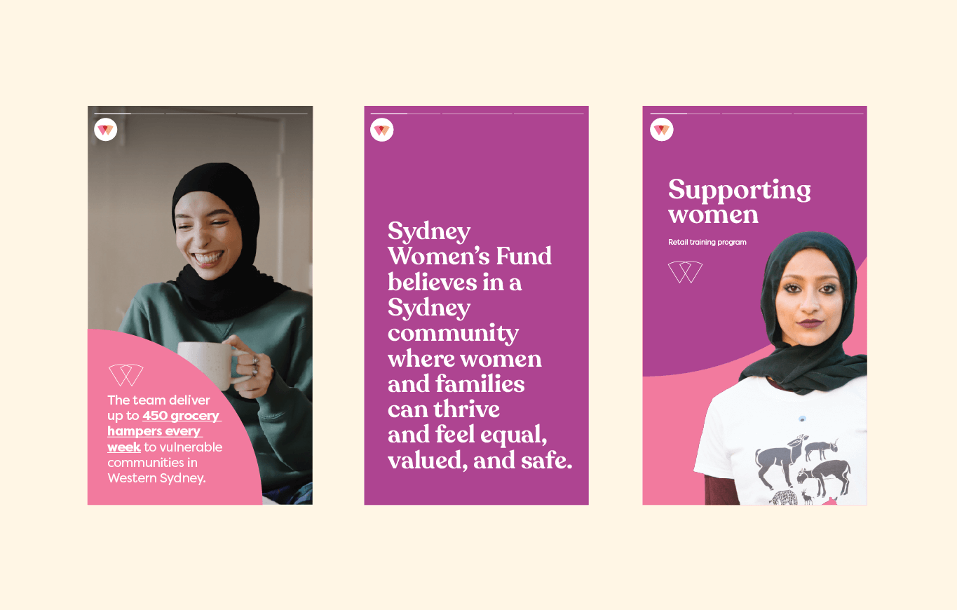
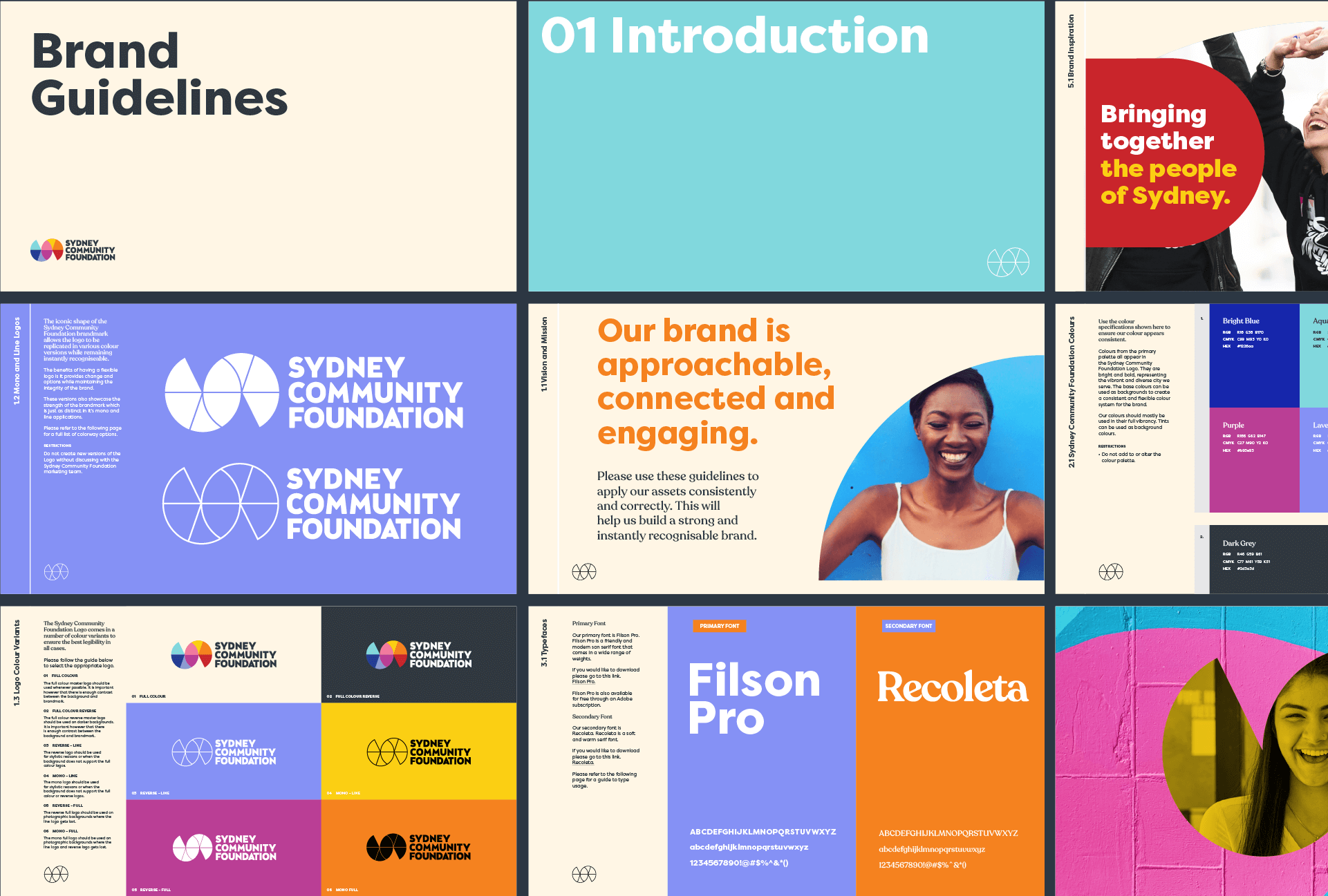
But the real work was in the system. Through stakeholder interviews, workshops and research we developed a shared visual language: a modular kit of geometric shapes extracted from the master logo, that can be recombined into a distinct mark for any sub-fund while staying unmistakably part of the same family. Existing sub-brand colours were absorbed into the master palette, so recognition flows both ways — parent to sub-fund, sub-fund back to parent.
The result is a brand architecture built for a portfolio, not just a pair.
New sub-funds can be onboarded cleanly without a redesign every time SCF grows. For a foundation built on connection, that’s not just good brand strategy. It’s a genuine saving in time, energy and money.
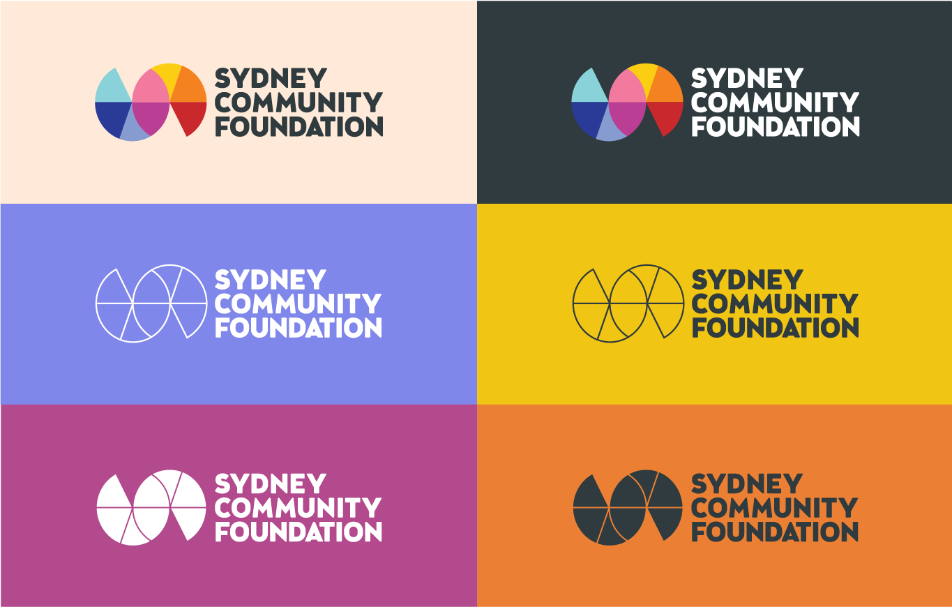
As for the visual identity – Sydney is bright, optimistic and hopeful, and the brand needed to say so at a glance. The master logo unfurls into a curved horizontal ‘S’ representing connection and momentum, with a subtle nod to the Sydney Opera House. Deliberately abstract, it gives viewers room to find their own meaning in it, mirroring how SCF itself operates: listening and enabling rather than dictating.
Which, when you think about it, is exactly what a great brand should do.
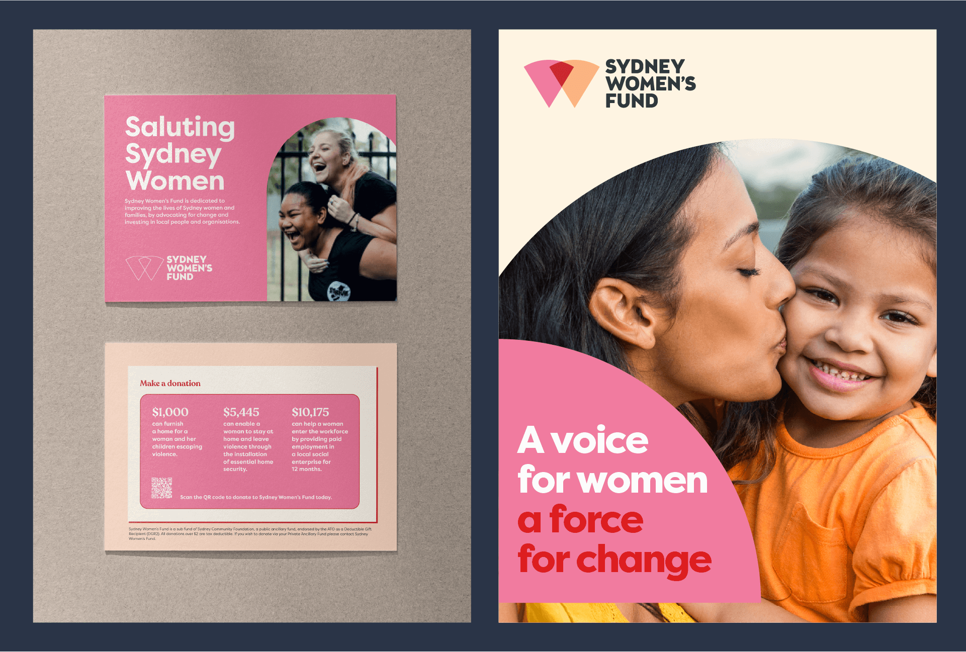
We gave Three Blocks Left a difficult task, to create a hierarchy of brands to help our audience better understand our structure. Sounds easy, but when your sub-brands are more well-known that your master brand, it’s quite the challenge. Kylie and Kass helped us articulate what we wanted to be, represent and who we wanted to serve into the future. We realised, that Sydney is bright, optimistic and hopeful and that the Sydney Community Foundation brand should reflect that. They came up with a brilliant device to make the sub brands reflect the master, a collection of its key elements and have delivered something to last.
LOREDANA FYFFE , CEO, SYDNEY COMMUNITY FOUNDATION

 PREVIOUS

