

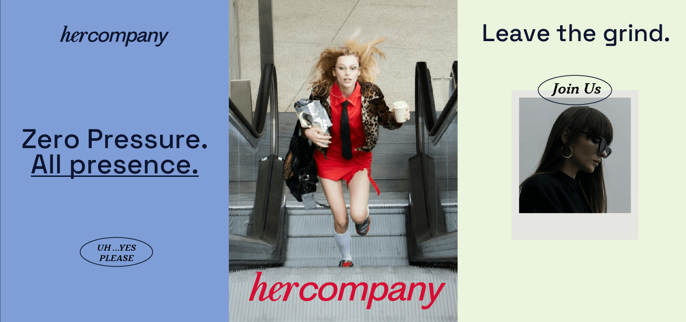
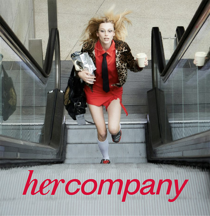
HERCOMPANY
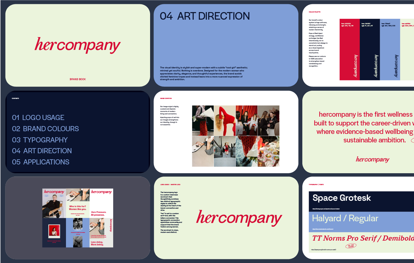
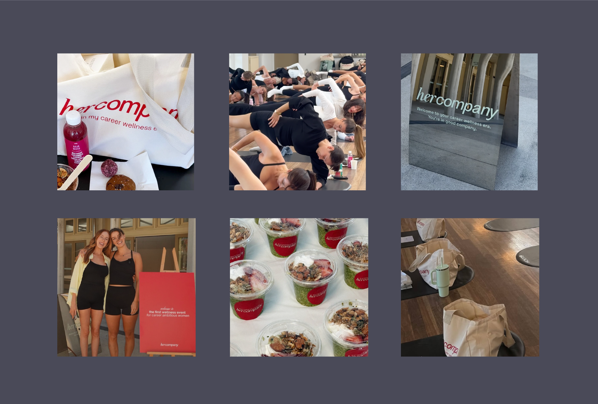
A fresh identity for the first wellness event designed for ambitious women. Modern with soul and feminine without the cliché.
THE SITUATION
Jarrah and Georgia saw a gap in the market for an event that they would want to attend themselves. Where the different parts of themselves were honoured and tended to. An inspiring, restorative and intentionally designed event where ambitious, driven women who “do it all” are given permission to reconnect to themselves and expand into what’s next without the pressure to perform. Ambition with alignment. Presence over performance.
THE SOLUTION
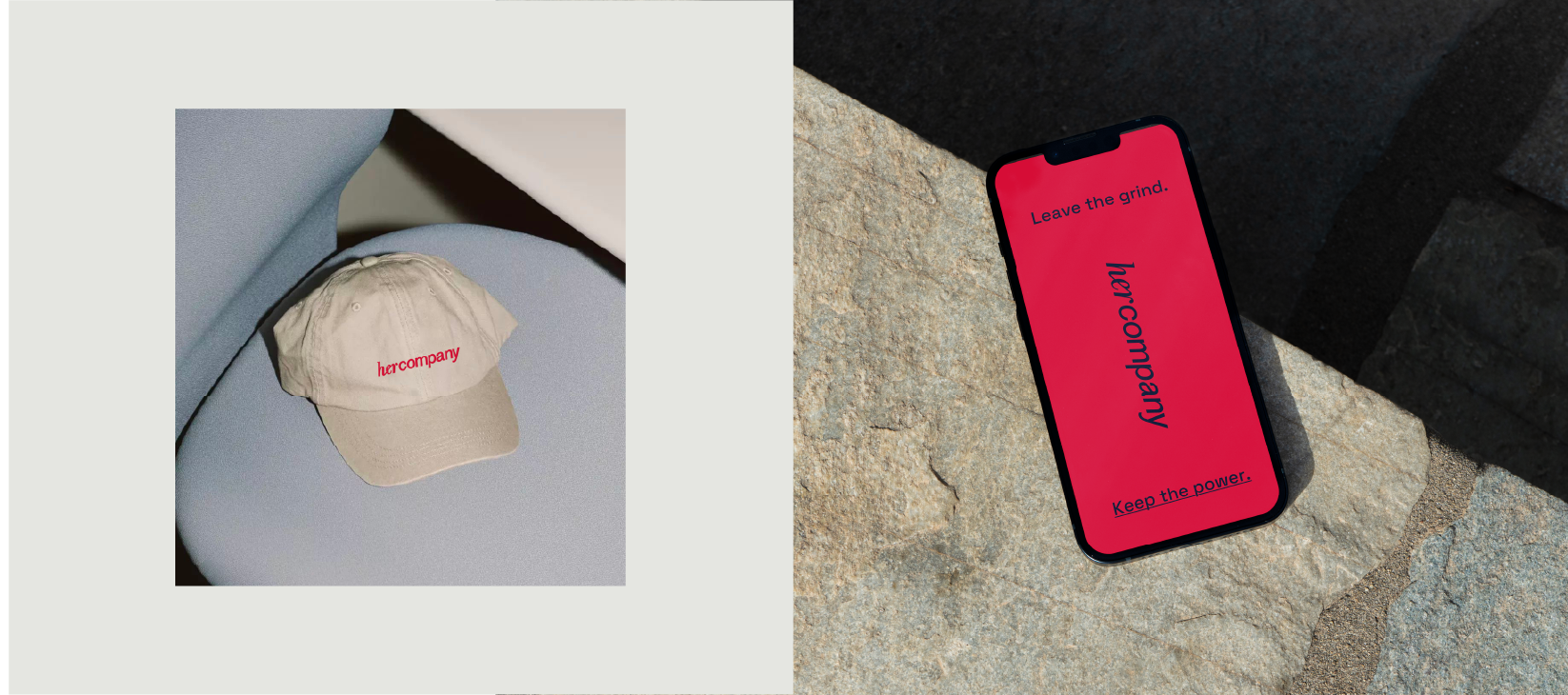
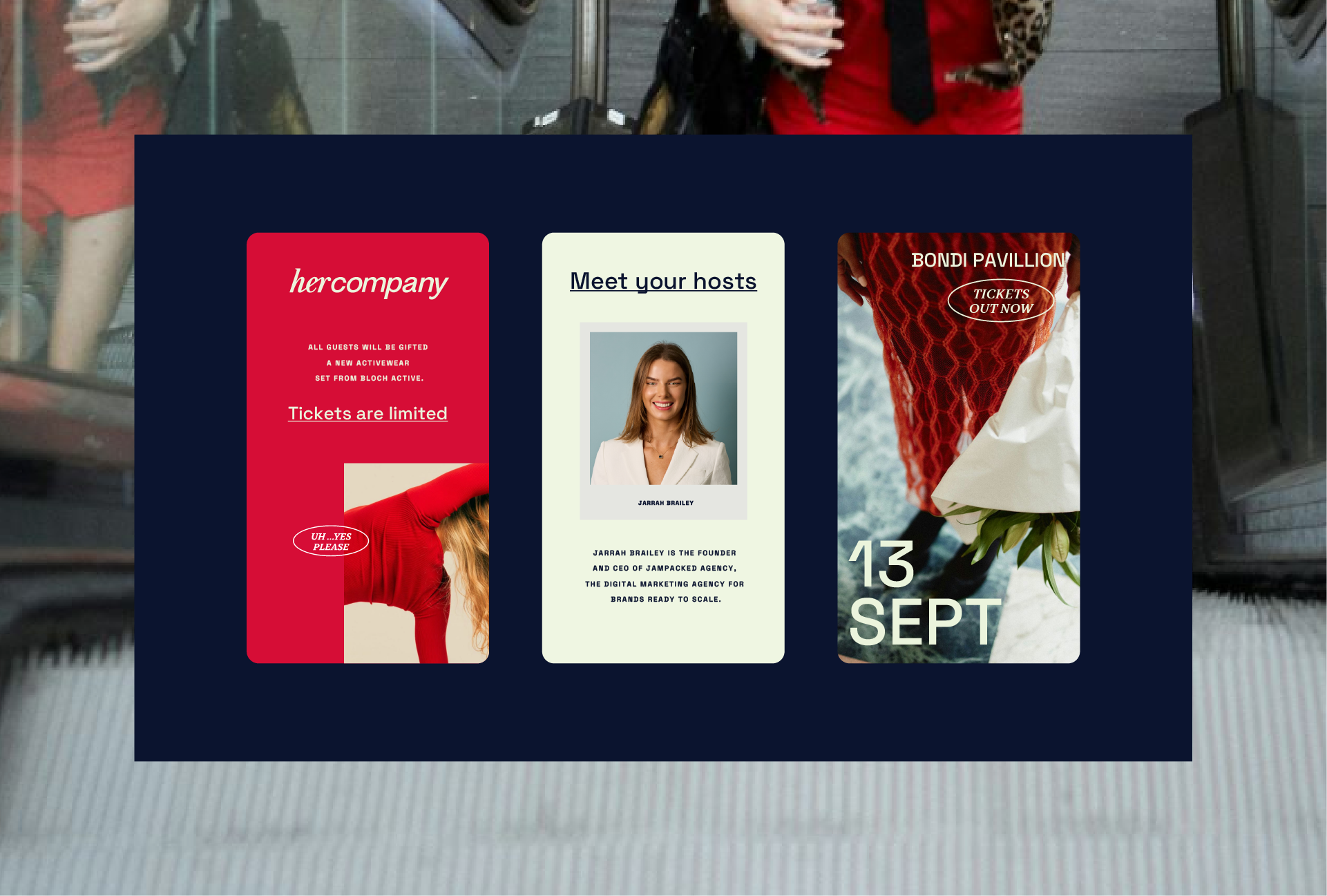
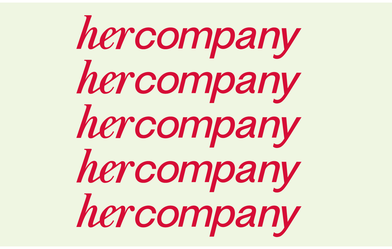
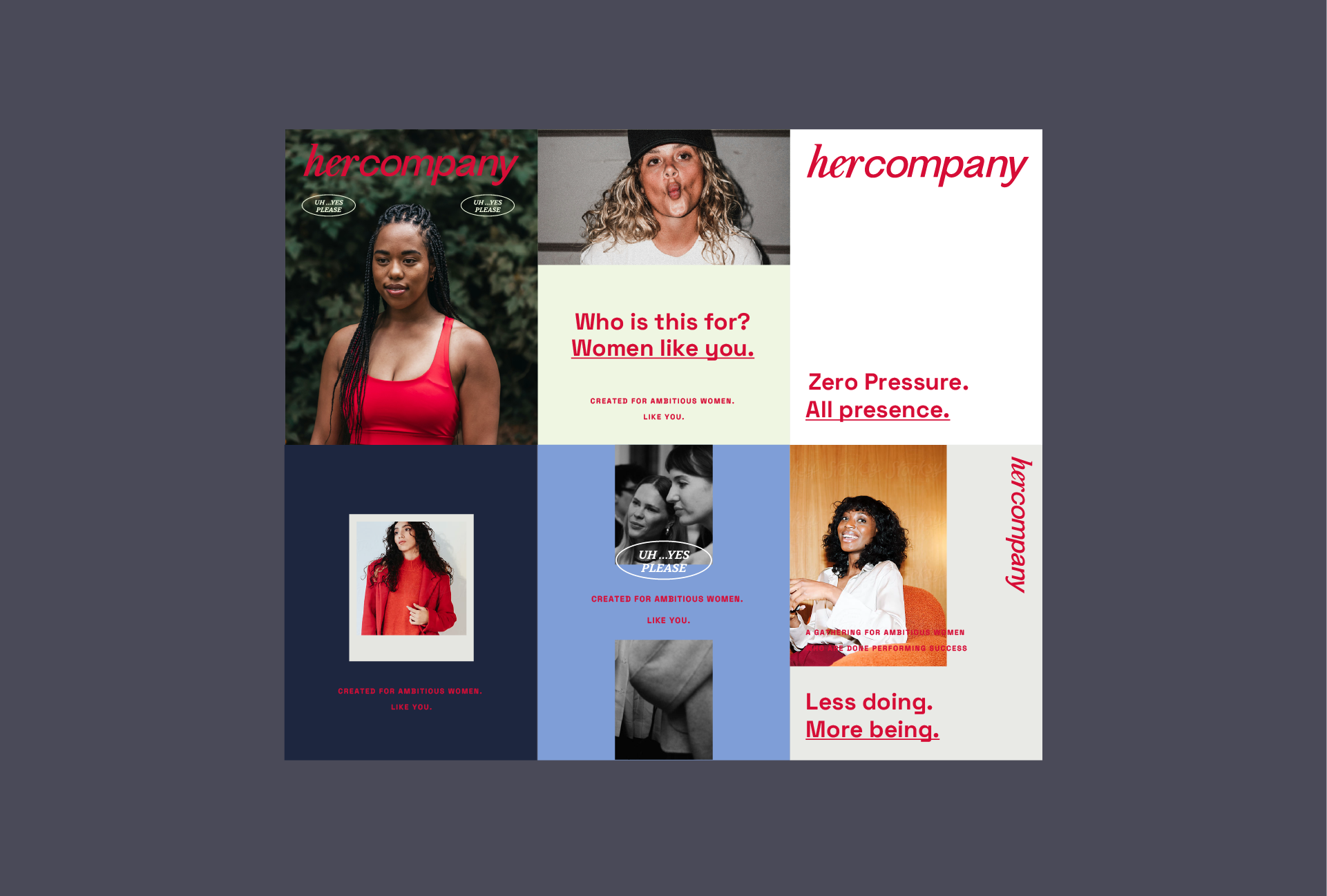
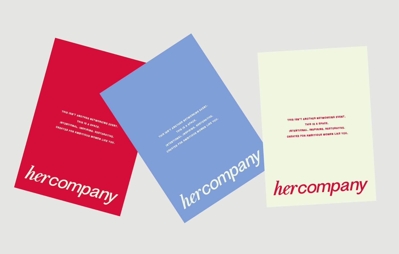
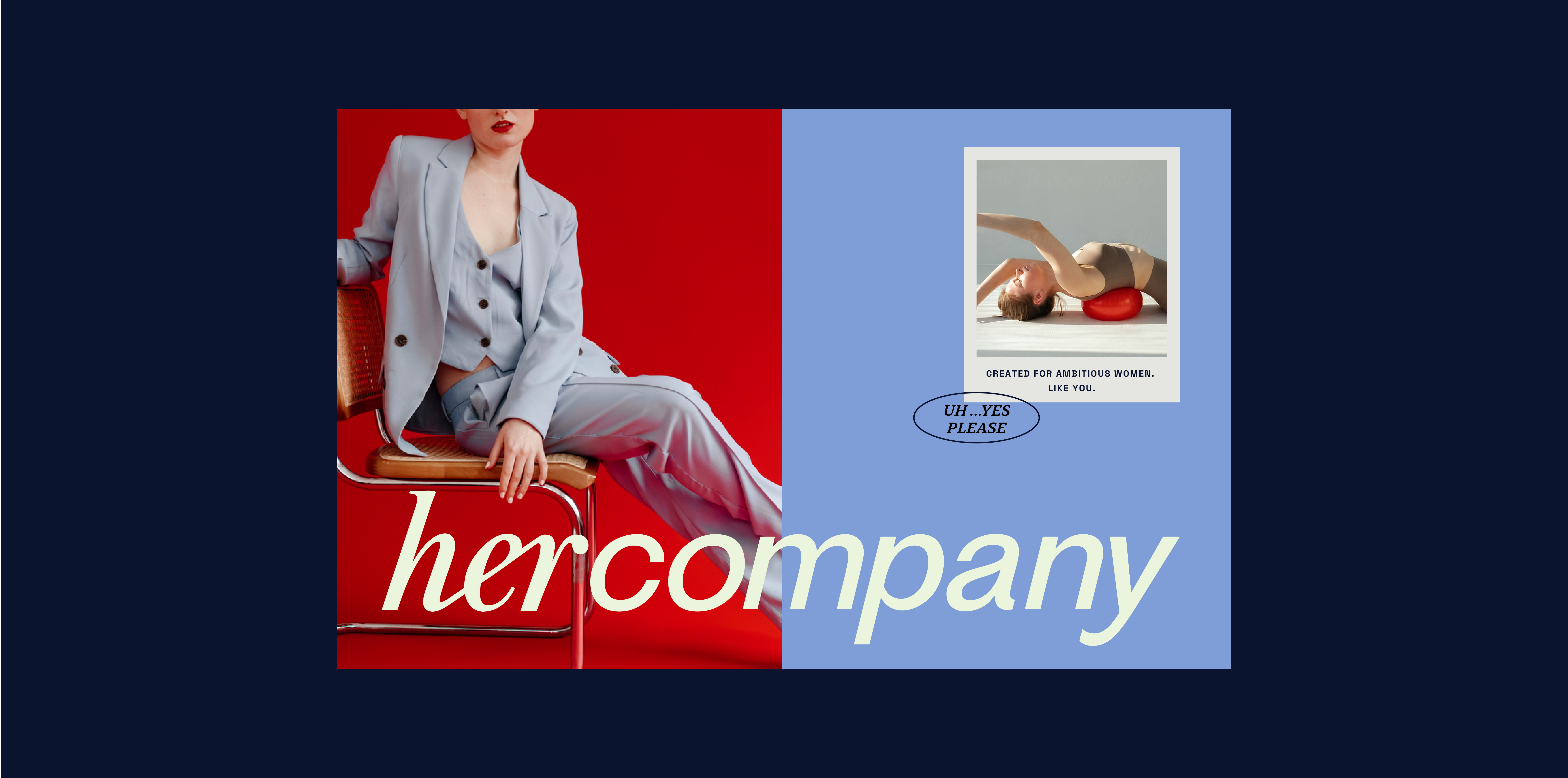
Guided by their values, we created a visual identity built on contrast and cohesion. Modern but with soul; feminine without the clichés. The logo is a custom lowercase wordmark that thoughtfully combines two distinct typographic styles to reflect the duality at the heart of the brand. Designed for the modern woman who appreciates clarity, elegance, and thoughtful experiences, the leans into a nuanced expression of strength and ambition. Every detail, from the wordmark to the colour story to the language, reflects this deeper purpose: to offer ambitious women a space where wellness isn’t a luxury, but a foundation for sustainable success.
Working with the Three Blocks Left team on the branding for our next venture (hercompany) was everything we hoped for and more. From the very first call, TBL understood our vision and took it to the next level. They somehow translated all of our chaotic Pinterest boards, emails and ideas into a brand that feels so intentional and something we were really proud to put out into the world. Thanks TBL for nailing it, as always! The real deal when it comes to branding that’s both strategic and beautiful
JARRAH BRAILEY, FOUNDER AND CEO
 PREVIOUS

