

FAIR FOUNDATIONS
New strategy, name and identity as Community First Step enters its new era as Fair Foundations.

THE CHALLENGE
Fair Foundations had outgrown their brand. Over 50 years, they’d grown from a grassroots neighbourhood organisation into a major multi-service provider across Western Sydney — but their identity still read as small-scale, creating real barriers to access in one of Australia’s most culturally diverse and disadvantaged regions.
THE SOLUTION – CO-DESIGNED WITH THE LEADERSHIP TEAM
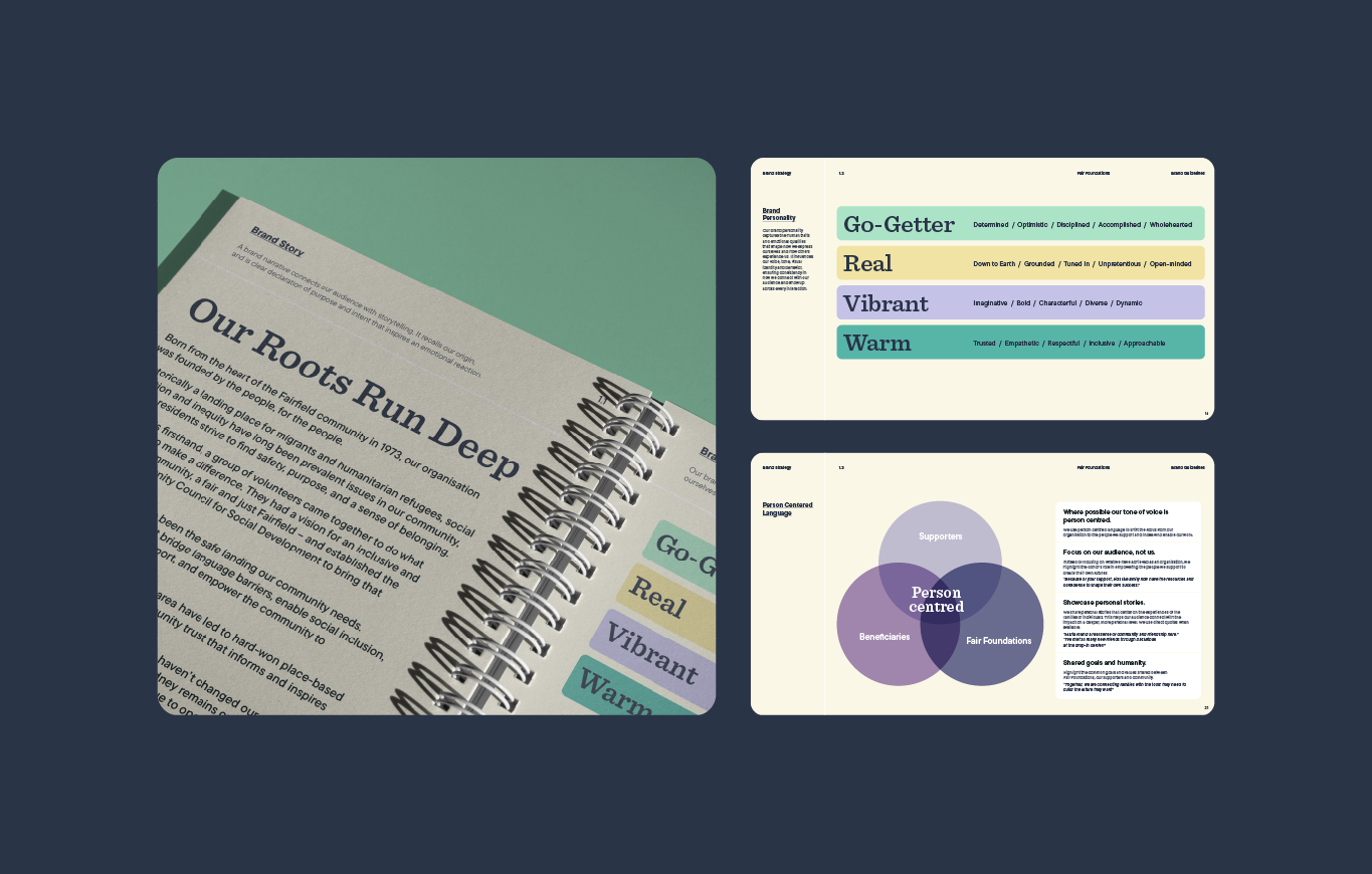
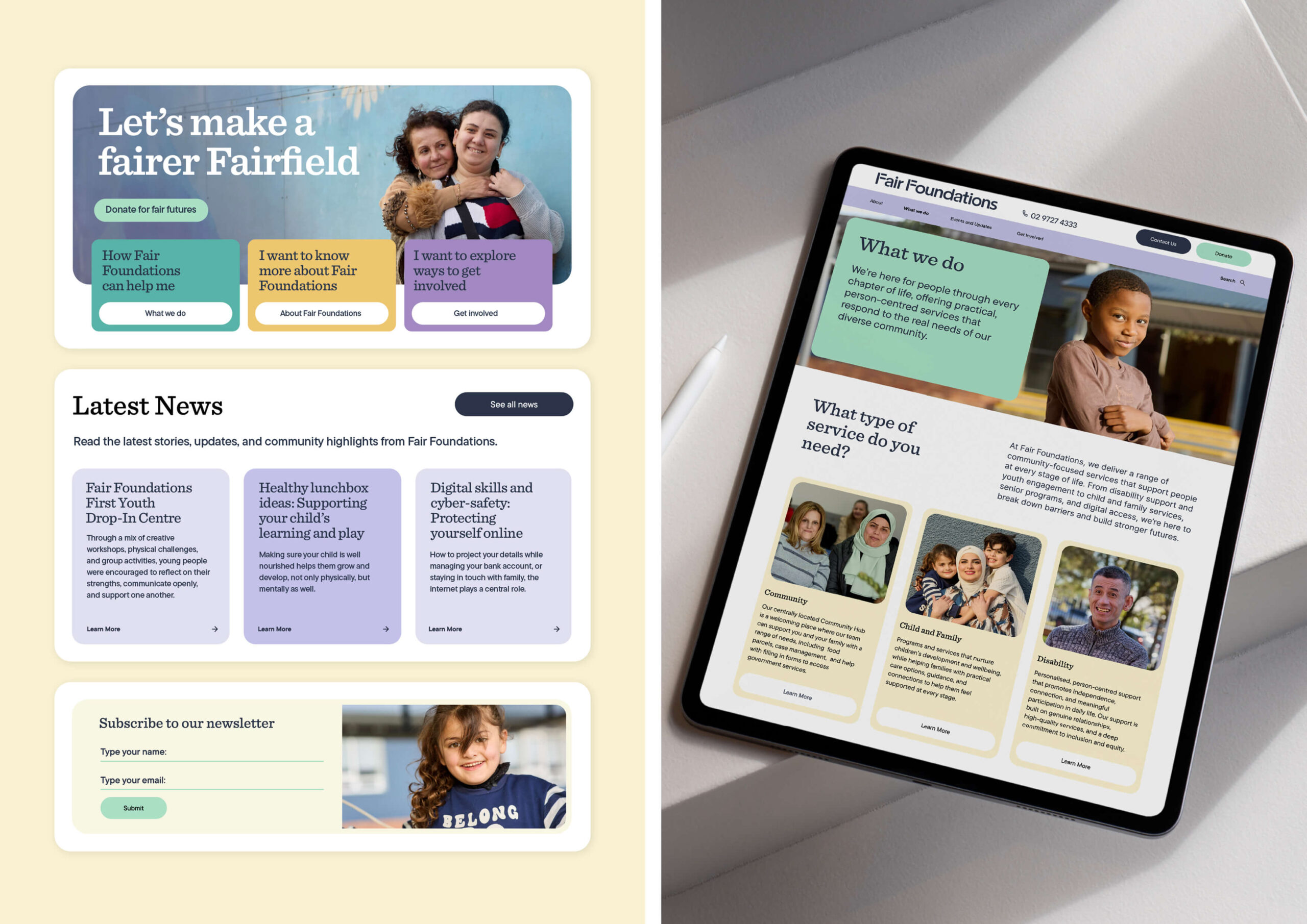
We ran stakeholder workshops and went deep into community experience to find what the brand needed to hold: accessibility, heritage, safety, grit, and love. From there, we rebuilt everything – strategy, naming, identity, and digital experience – around belonging, social equity and the brand idea of ‘pushing forward’ – active, gritty and forward moving. The outcome is a system designed to earn trust across CALD communities, help more people find support, and give the Fair Foundations team a brand that finally matches their ambition.

“One of the things that mattered most to us was that our community could see themselves in our brand – their languages, their stories, their sense of belonging – and that this was reflected with respect and authenticity, alongside the scale of our impact. Three Blocks Left understood that immediately. They not only brought sharp thinking and a fresh perspective; they were generous with their ideas, collaborative in their approach, and entirely invested in getting it right. The result is Fair Foundations – a name and visual identity that is deeply connected to community, grounded in equity and a genuine love for humanity, and strong enough to carry our purpose into the future. We are very grateful to Three Blocks Left for such a thoughtful and beautiful portrayal of our organisation and the community we work with.”
PANDORA PATTERSON, CEO
DESIGN STRATEGY
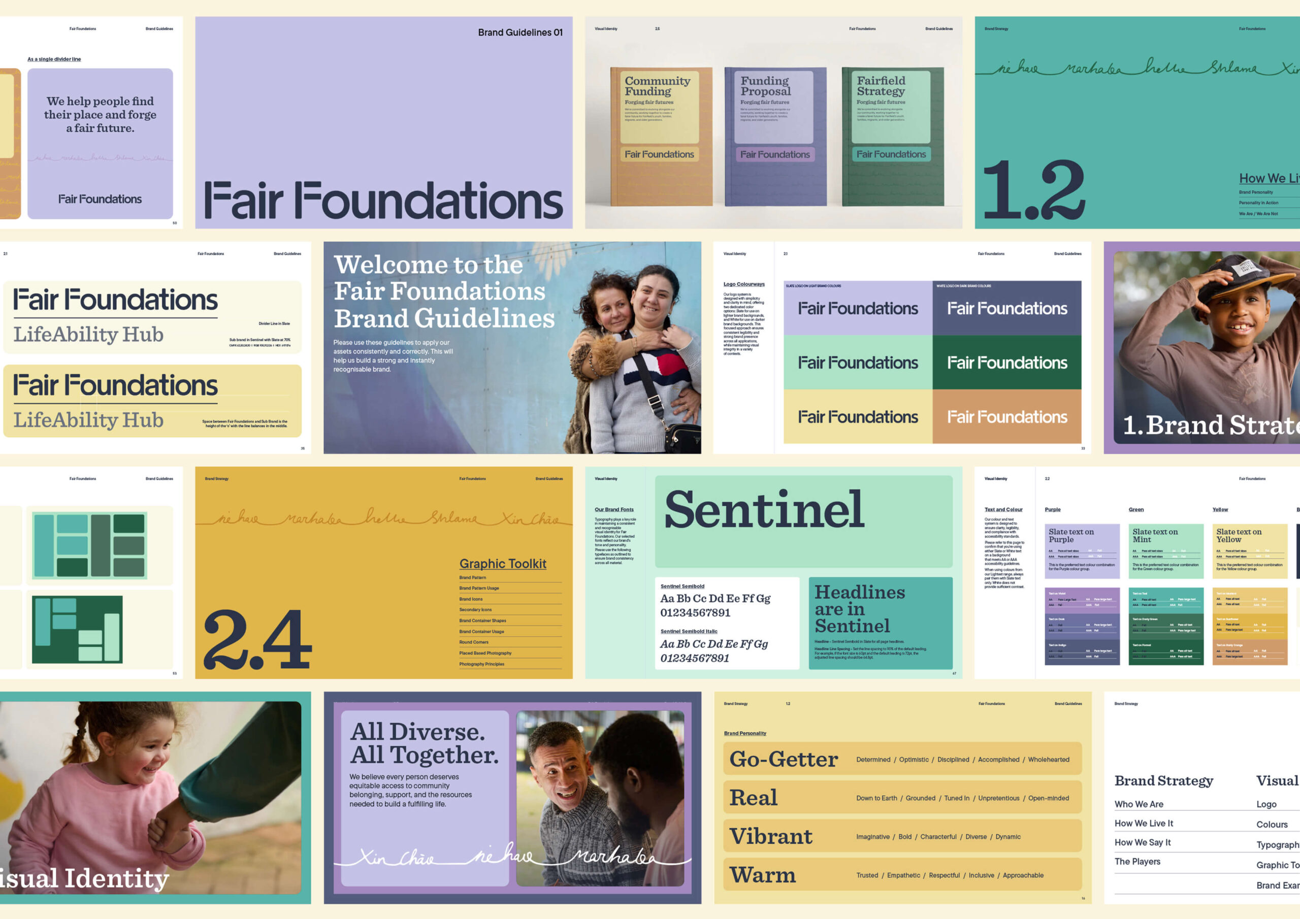
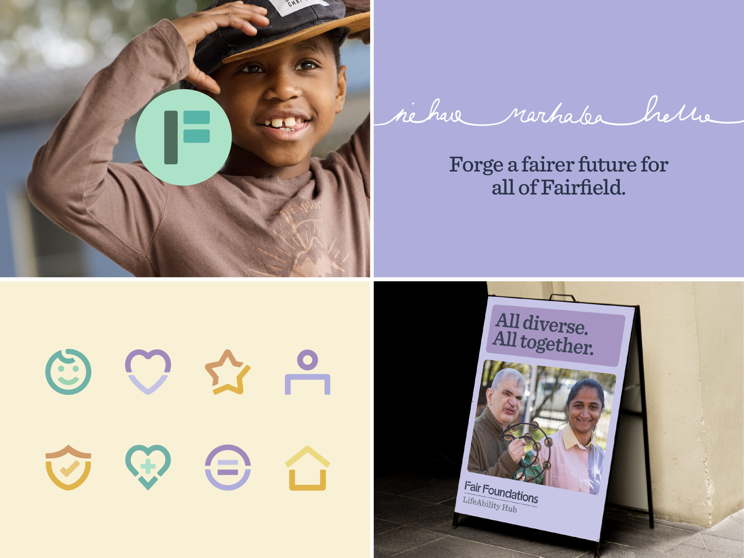
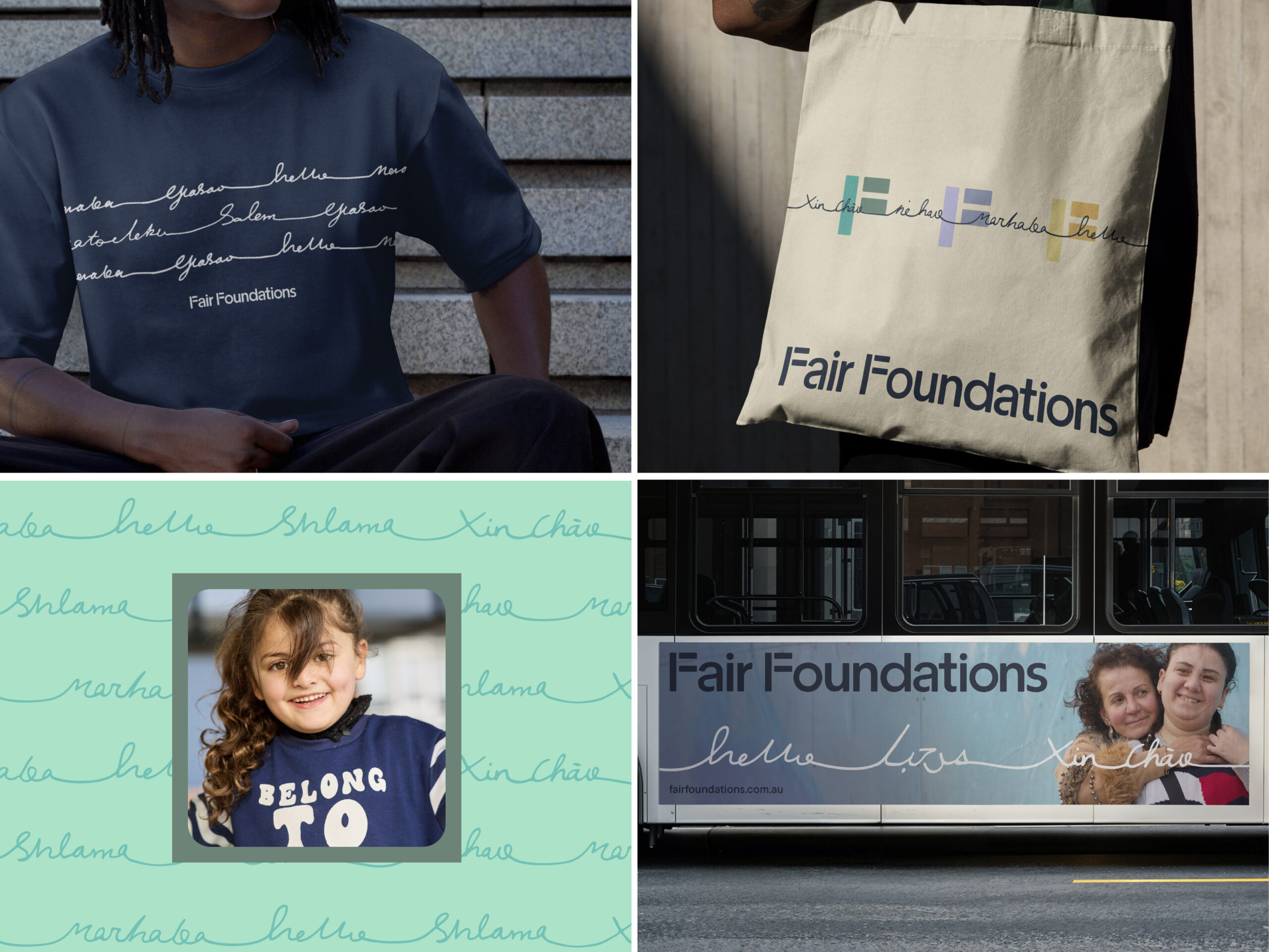
Styling an equals symbol into the F of the custom wordmark embeds the theme of equity into the cornerstone of the identity. As a mathematical symbol, it is a universally recognised mnemonic for equality and transcends the barriers of language, meaning it’s understood and used the same way across different cultures.
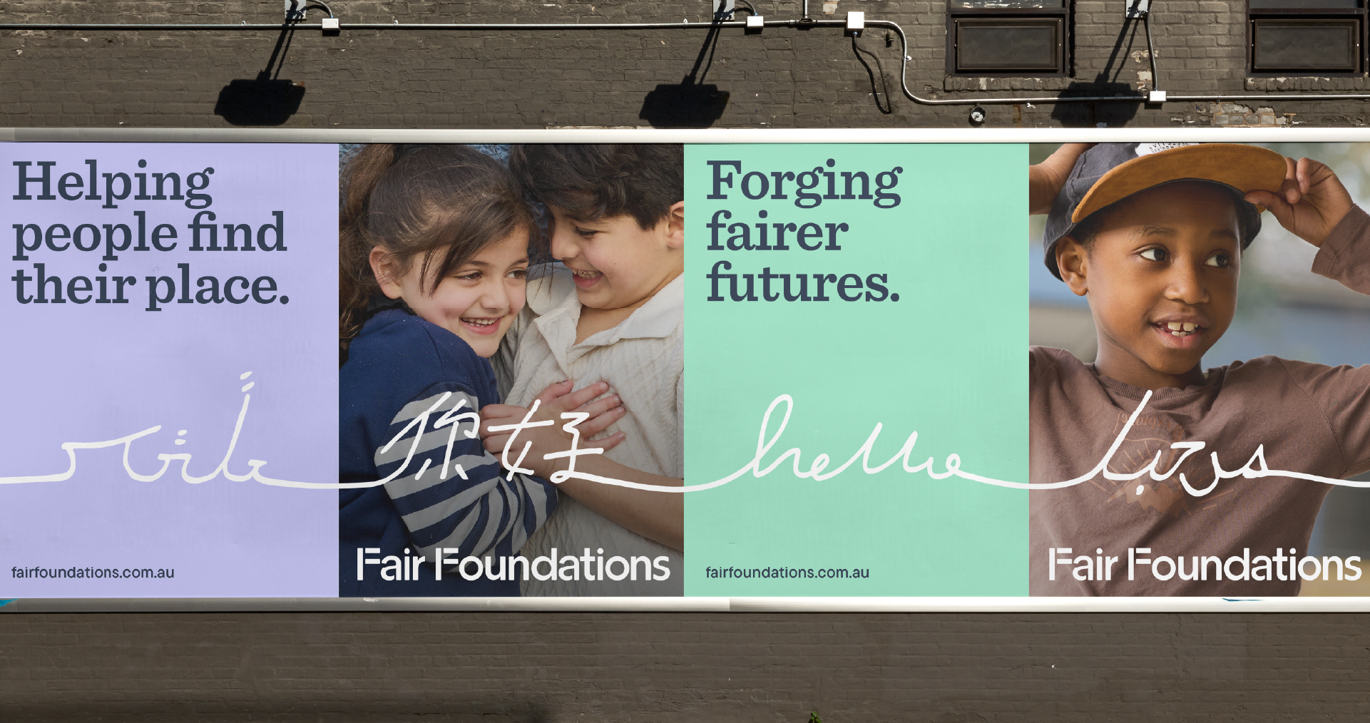
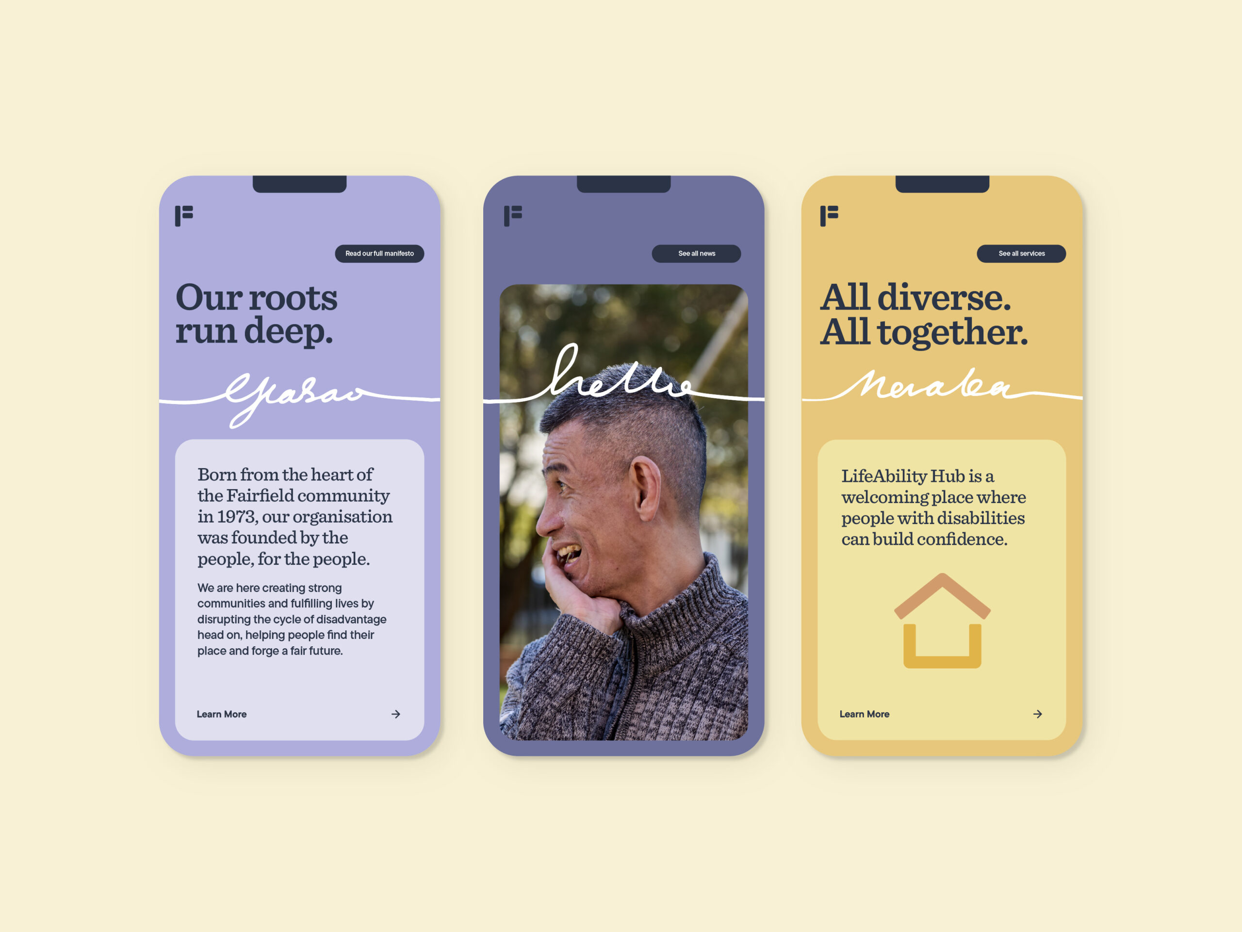
The primary graphic device of the brand is a continuous-line pattern featuring the word “hello” in multiple languages. The hand-drawn nature of the line adds a human, evolving quality and is symbolic of inclusivity and growth. This graphic device becomes a signature visual element across the brand with scope for different words and iterations being developed over time, allowing the brand to stretch, evolve and respond.
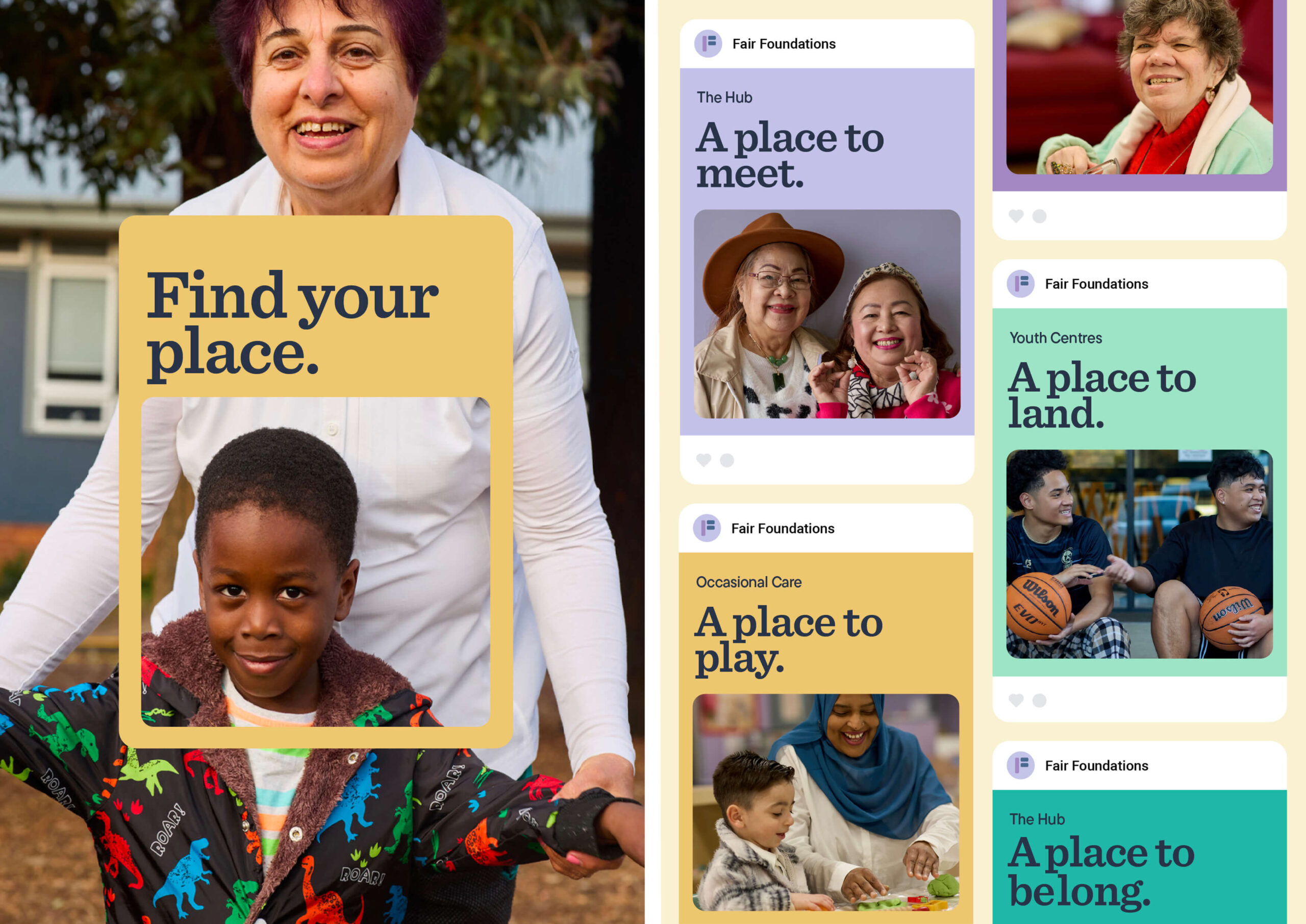
Paired with warm, unique and high quality photography by Bec Hannaford Photography that centres the people and places of Fairfield, their audience immediately feel a sense of familiarity, connectedness and belonging.
The new brand is vibrant, human, and deeply connected to community. A bold expression of a future built on equity.

 PREVIOUS

